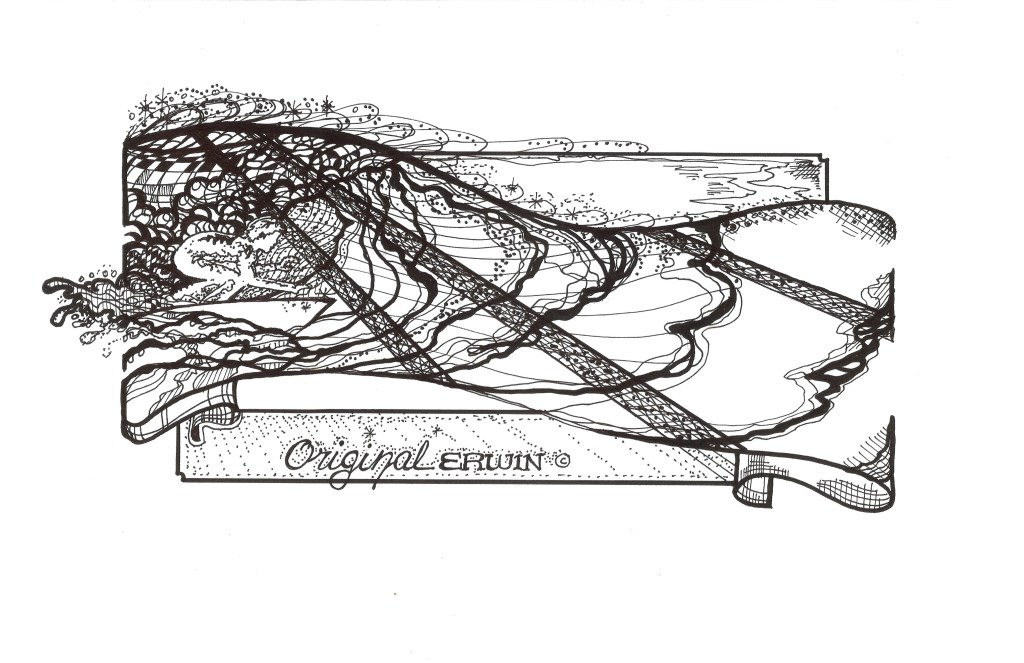
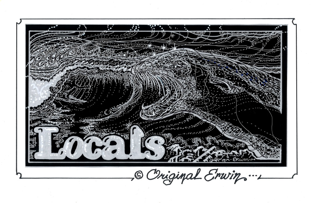
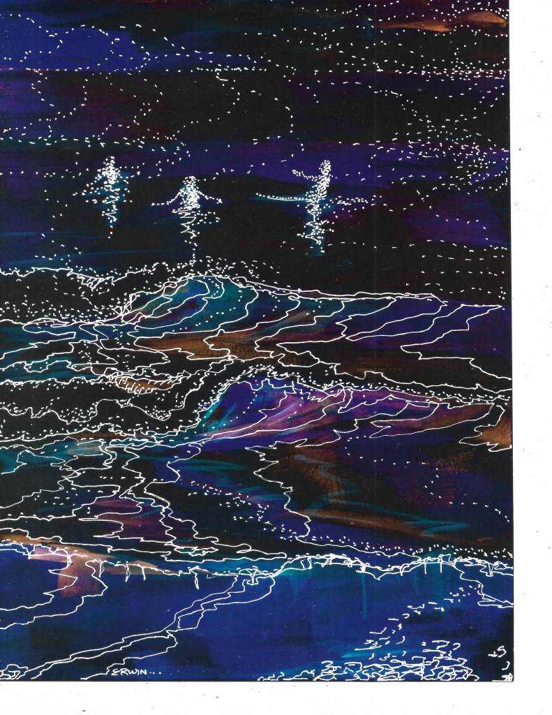
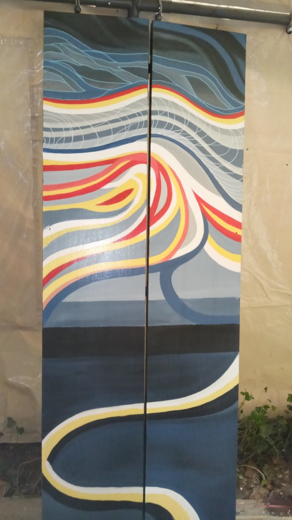
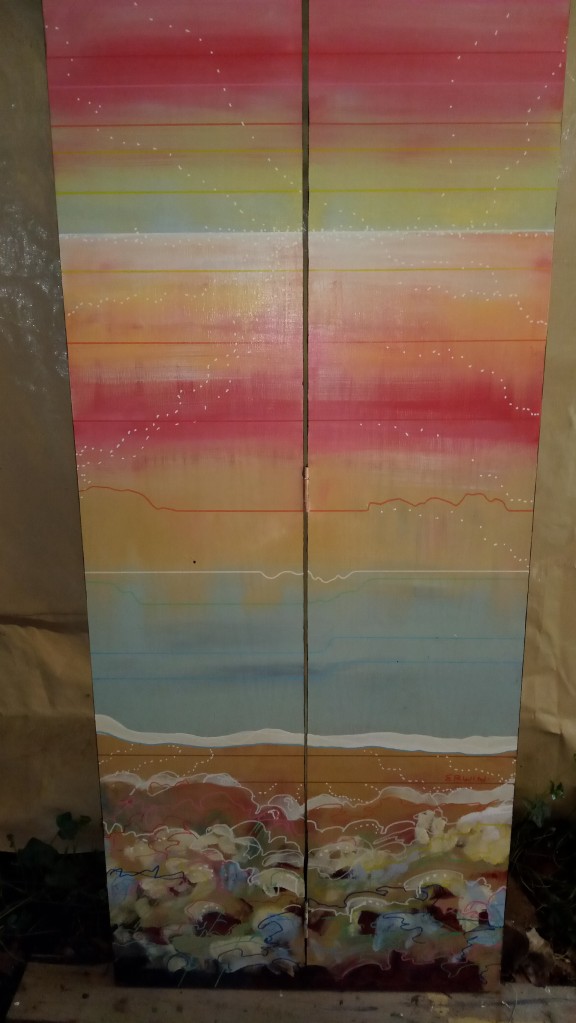
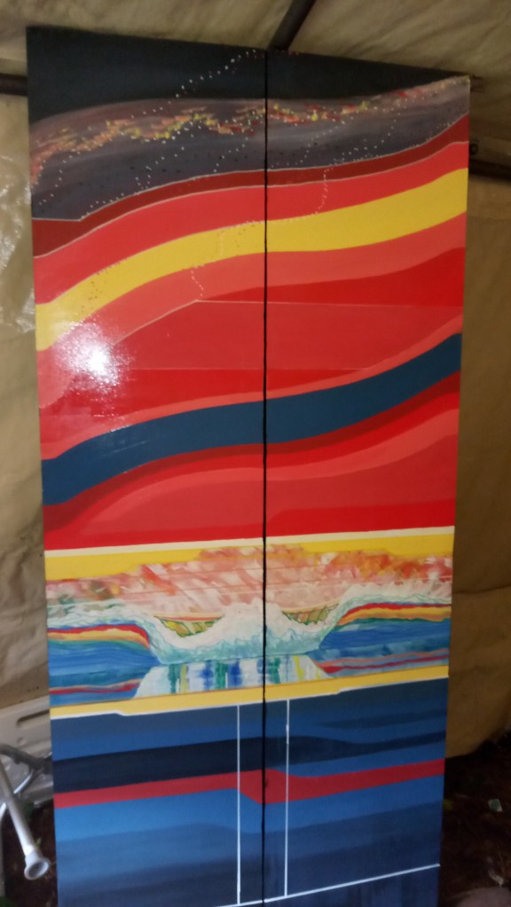
Trish wasI, as always, correct when she said I had become obsessed with these door panels I have been working on; four by-fold doors rescued/salvaged/pack-ratted from some job. My theory was, because everyone has limited wall space for art, these would serve as screens, or even, doors.
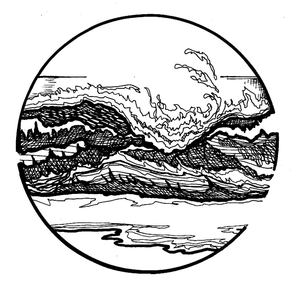
Yes, there’s an inside and an outside, and I kind of lost track of what was on one side when I was painting the other side. It wasn’t all, like, thematic. Maybe a little. Obviously I have some sort of fascination with waves. And color. I would start out, get to something that was not what I envisioned and… here’s the obsessive part; I would keep going until l was a high percentage of satisfied. The fear at some point is that I could then screw the whole thing up. A line too far. Or a color. Or… something.
I want to thank Joel and Rachel Carben, owners of the COLAB in Port Townsend, for allowing me to have my art in their space. Although I paint houses for a living, my artistic leanings have been toward drawing.
SO, I am not at all sure what to do with these panels now. Hanging out for three of the monthly Port Townsend ARTWALKS has reinforced my belief that marketing is not my strong suit. Not even close. SO, do I tell myself that the joy of art is in the process? That is true, but… but, but, but…
Captions: Stephen R. Davis approaching the wall of doors at the COLAB;Joel Carben and Steve; a framed painting that caused Steve to comment,”It’s nice that you’re finally going for fine art,”; various panels taken where they were painted (a Costco/White Trash garage). OHHH, and then there’s BIG DAVE.


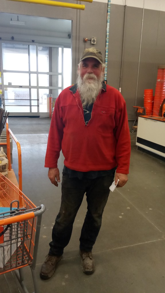
I took this a week or so ago at the Home Depot in Sequim. I had already heard a rumor that Legendary Surfer BIG DAVE RING was giving up surfing due to arthritis in his knees. I did write about this. The rumor was confirmed. *Sort of. Quickly, Dave was raised in Pacific Beach, San Diego, and was part of the pack of “Pier Rats” that included standout, Joe Roper. Dave, currently 66, was fourteen when I moved to PB in late 1971. I was twenty. Not a big talker in the lineup, not a guy who hangs out and chats it up on the beach, part of the reason I found out any info at all is because we have been mistaken for each other, as in: “I read your last thing on your blog,” to Dave, or “I heard you were ripping the other day,” to me.
Most of this was back when Dave was merely rocking a big-ass mustache. We both were riding big boards (Dave a 12′ SUP as a regular surfboard), and we both caught a lot of waves, from the outside, or scrapping for insiders. Dave is a master of the late takeoff and the sideslip, and plows through sections I would dodge..
A notable quote that got back to me was, “I rolled up and the Walrus and the Beast were both out. I went somewhere else. Though I’m almost more comfortable with being referred to as ‘That asshole wavehog, kneeboards on a SUP,” and I’ve been doing my best to increase the size of my mustache, I must agree with those who say Big Dave is the Walrus. Coo coo ca choo, coo coo ca choo.
*Having already, in a pattern that seems to hold true among older surfers, moved from popping up automatically, to knee boarding the takeoff and standing up after the first section, to kneeboarding the entire wave, Dave expressed little interest in belly boarding. “No, but…” I could tell Dave was imagining the perfect pre dawn session, sneaking out, lining up a few bombers.
“It is amazng,” he said, “what I’ve gotten done because I’m not always putting stuff off to go surfing.”
I get it, Dave.
EYE and LEG UPDATE- I’m finally through with the wound care for the gouge on my right calf. Pretty impressive scar. I am going to have my eye checked out on Friday, with surgery to remove the clear oil inside it, hopefully, scheduled for… soon. It isn’t as if I can’t work, it’s just annoying. I sort of attacked a woman in a parking lot the other day because she had a bandage over one eye. “Hey, what happened to you?” Different deal. Worse than mine. Nice conversation. ANYWAY, I did tell Trish that, because of the glare in the water, I might not surf until the oil in my eye is exchanged for (I asked) saline solution, that to be replaced by the proper bodily-produced fluid.
BUT, but, but… when I check the forecast…
Moving on. Back to another of my obsessions. After I post this, my plan is to get back to “Swamis.” I had friends attempt to read earlier versions. I know where I have to make changes, and I have been working on it. That’s my process. Evidently. Obsession, distraction; what we have to do and what we want to do and what we really really want to do.
Good luck with your obsessions.