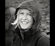
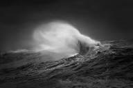
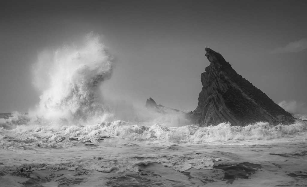
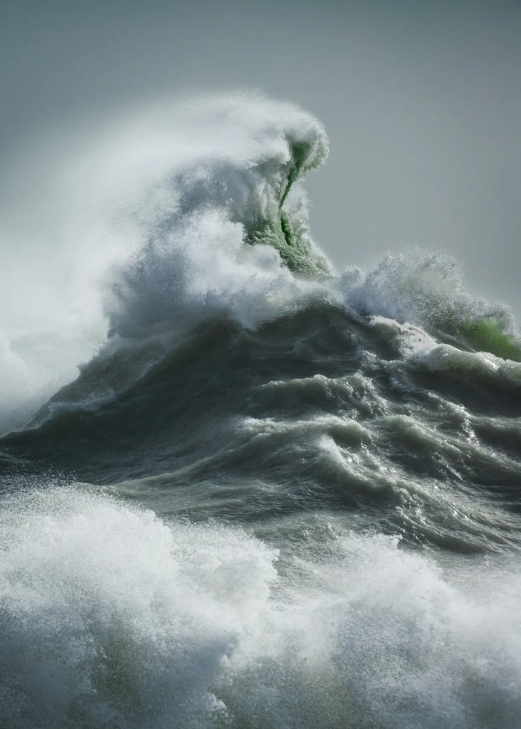
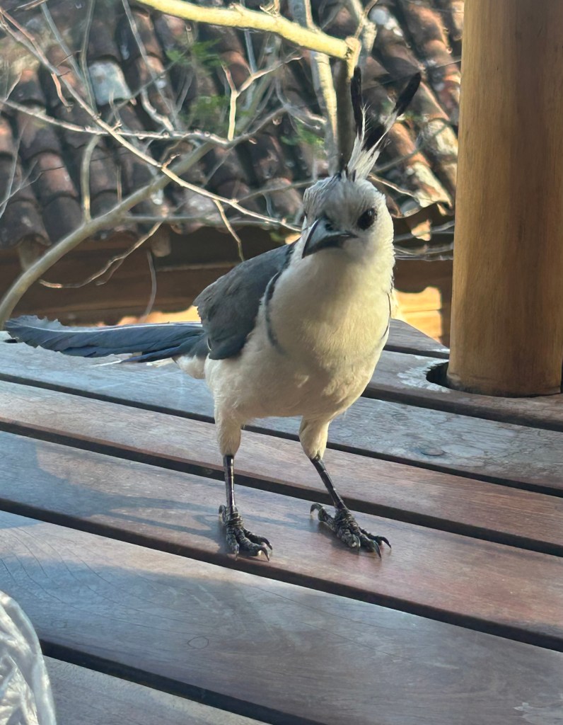
The photographer, abovve, some of her work, below.
I am writing something about how addictive INSTAGRAM is, but, while scrolling (and, can’t help it), and (occasionally) commenting, I came across some incredible photographs of the open ocean; the chaos and the power and the beauty, taken by Rachael Talibart. I HAD to comment. The first comment on a collection of black and white images, which I self-borrowed from a possibly edited-out quote from Ruth DeFreines in my novel, “SWAMIS,” (note the self promotion here- not there) was, “Our minds fill in the colors.” It got a like/heart (part of the addictiveness).
I, of course, had already hit ‘Follow,’ so I got more posts from @rachaeltalibart. I sent a comment saying I would love to include some of her work on my HUMBLE (not by design) blog, and she ‘replied’ it was fine if I include a working link to her website.
This linking is tough for me. I will get my daughter, Dru, to assist.
What interests me is figuring out what kind of person chases storms to capture the previously mentioned power and chaos and beauty, the source of what surfers seek, groomed-out and organized, of course. NOT a lot of bio stuff readily available. Rachael lives in the south of England, gets seasick, and takes on extreme weather so folks can look at the images (she has a book, “Sirens) in comfort, perhaps with one of them as a sort of window, framed and hanging in a formal room.
Anyway, thank you, Rachael. Heart/like.
Meanwhile, I’m getting my works together and planning on having Dru help with the formatting, pre-publishing stuff for my upcoming (I promise) collection, “Love Songs for Cynics.”
I do have some newly added Original Erwin additions on my other pages (nothing on the political or religious front at the moment), so check that out if you get a chance. Contact- erwin@realsurfers.net, Instagram- realsurfersdotnet. AND thanks, as always, for spending. a little time at my humble (not by design) site. GET SOME WAVES!
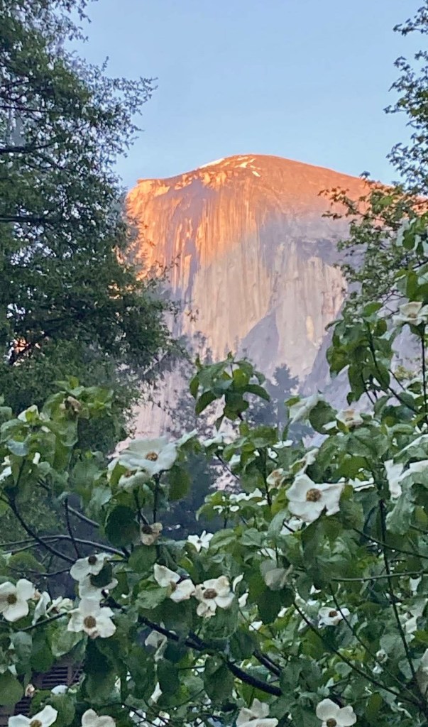
I was working in Port Angeles all week, never had (or gave myself) a chance to even check out the surf; but, then, wait for it (I have), I went. Yeah, I joined the seeming caravan of time-offers and weekenders and vacationers headed toward the Olympic Peninsula, home to the Olympic Mountains, named, appropriately, after the mythical home of the mythical gods. It’s like… Nirvana, with a different lineup (do I have to add ‘not the bend? Probably). Yeah, and there’s, like forests and… lakes, and… It is enticing, entrancing, inviting those stuck on I-5 to drive however many hours to get here. And the weather has just been so… Southern California-ISH. Not that I’m complaining.
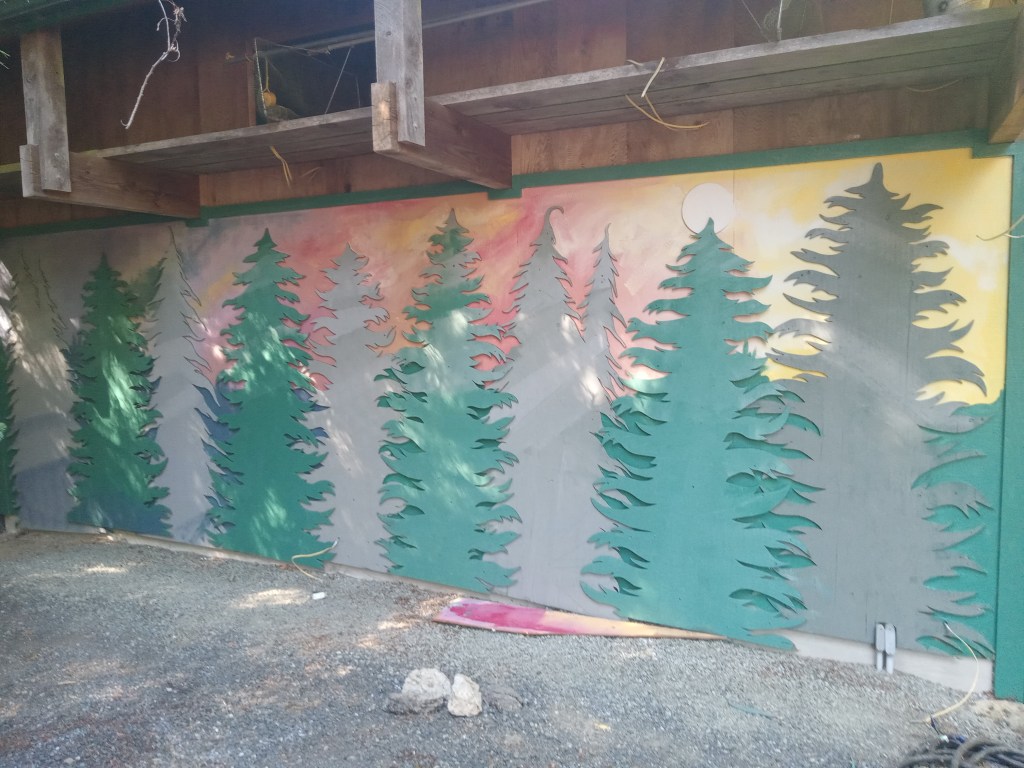
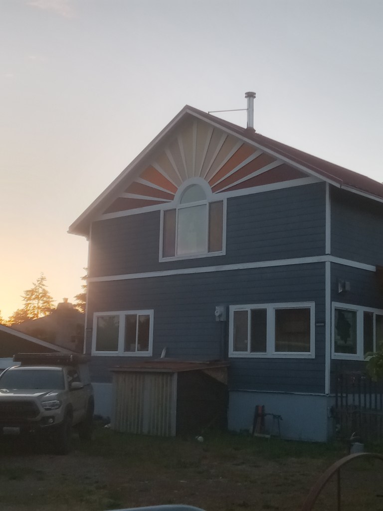
This was a side project. I was painting an ADU on the Port Angeles property. Someone else cut out the trees a while back. The homeowner, who has a lot off artsy stuff going on, gave me free reign. Thanks.
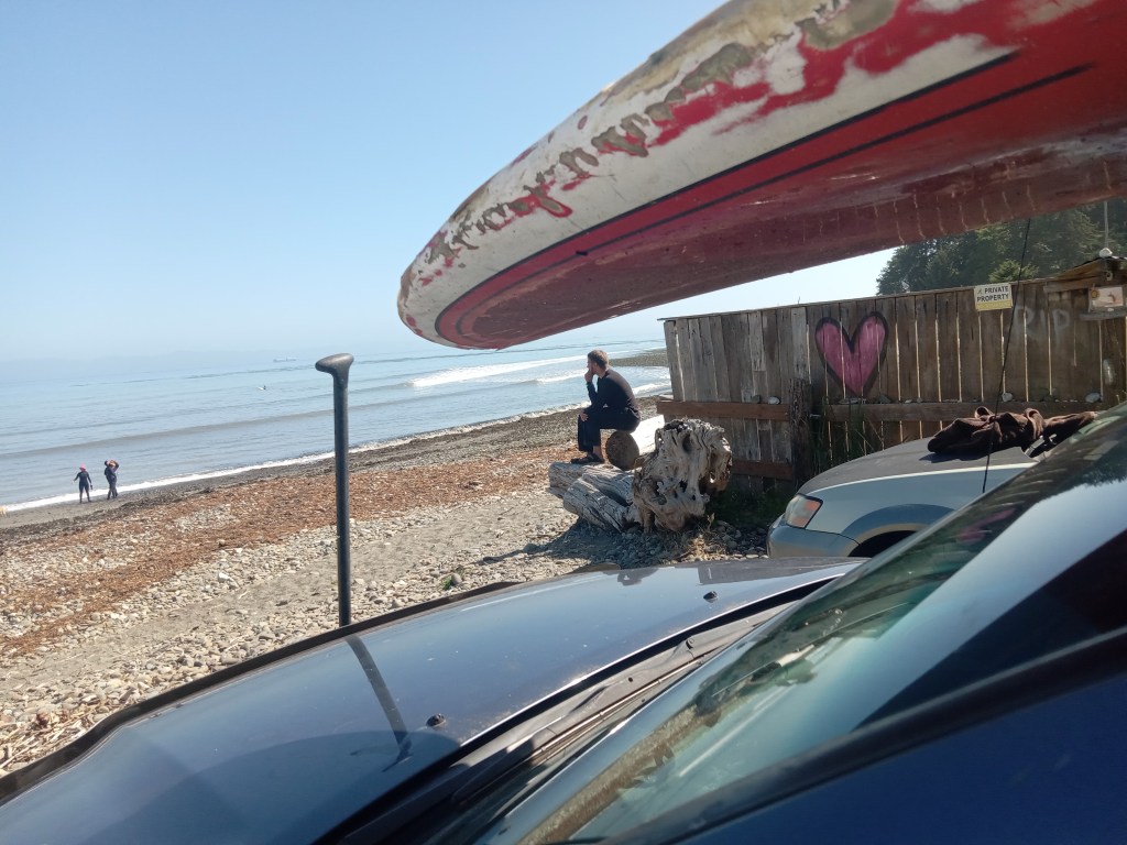
The job done, I traded ladders for a thrashed out board, and headed back north. It’s not that I want to share the road OR the waves. Dawn patrolling might help. Still, I worry. I am still trying to get past a severe thrashing from mid-winter, and have had few opportunities to rebuild my. confidence. What if, I was thinking on the way up Surf Route 101, it’s closed out and crowded and… ?And then, when I arrived… no worries; no ‘got to go NOW’ conditions. Barely breaking. It was a ‘it might get better’ situation, so, normal. Not crowded… yet. No side wind. Yet. I took my time, chatted with PA locals, Bill Truckenmueller (sp?) and his son, who talked about how the day before was better, and never got out of their van, and told me they were leaving as a sacrifice to the swell gods. “Thanks. I’ll let you know what you missed next time I see you.”
Parked in my favorite spot was THOR. I’ve surfed with him quite a few over the years. He said the previous day started similarly weak and inconsistent, and got better. The last time I saw Thor was at the Lower Elwha gas station. He had just suffered a serious injury. He’s fully recovered now. I filled him in on what is happening with me. I did, because I do, mention this blog. “You. mean your personal complaint department?” ‘Huh? What? Um, yeah.”
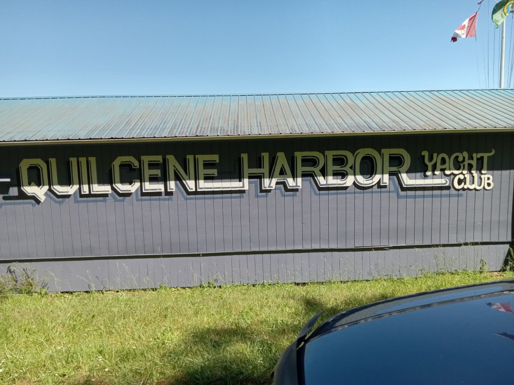
Still taking my sweet time getting suited up, a rig pulled up next to me, two young (relatively) men jumped out, instantly started putting fins on their fancy wood boards. Just making conversation, because ERWIN TALKS TO STRANGERS, I mentioned their parking gave themselves plenty of room, but they could have parked closer, allowing the next folks room. “No.” Okay. No disagreeing. I asked one of them how long he’d been surfing. “A while.” “Oh. Did you, like, start during Covid?” “Give me a break.” “Okay, so… adult learner. Surf school.” No answer. “It’s pretty flat. Hobuck’s probably big. Maybe you should go there.” The other guy came around the corner, turning his Patagonia wetsuit rightsideout while doing modified squats. “Why don’t you go, then?” “Too far. Too scary.” “Sure.” Possible sarcasm. “Um, where’d you, if I might ask, come from?” No answer. “I live in Quilcene. It’s down the canal.” “Okay. Sure.” Somewhere it was revealed they were from Kirkland. “Might be bigger there,” one of the Kirkland dudes said before he raced his friend toward the water.
It’s fine that, when flipping friendly-ish shit, some gets flipped back. The test of surfing is in the water. By the time I got out, there were five or six other surfers out. Long boards. I took off on a wave, not believing (or looking) behind me. “Hey!” A guy on a green longboard, who wasn’t on the wave, yelled, “You have to look. That’s it! You get. one. drop-in!” He paddled out. I paddled out. He back paddled me. Evidently backpaddling was acceptable. Fine. Game on!
I don’t mean to overdramatize this; not high tension. Just, with not-great waves, kind of unnecessary.
There were some other ‘your wave, my wave’ things happening over the course of the session, but I didn’t have any other disputes with the unofficial regulator. He did continue to backpaddle, I played my game, managed to get some rides I was really happy with. Meanwhile, the Kirkland guys did not dominate. The lineup had the usual small day ratio of beginners to experienced surfers, and I noticed several of the guys in the water looked… similar. We all want to identify who, in the water, is going to blow a takeofff, who is a bit too aggressive; all of which helps us catch more waves and stay out of trouble. Maybe. Plus, it’s not cool to stare at your. competition. Or talk too much.
None of these societal restraints kept me from paddling over and making a comment to the large (not that I’m small) woman with a bright red, full-brimmed hat on. It seemed, not staring, that it was attached to a hood. Maybe it just had a very practical chin strap. “You’re doing your best to avoid cancer,” I said. “I’m trying.” She took off on a wave, went straight, and two other women, with similar hats, about to paddle out, hooted, wildly, as if their friend had won the contest. Perhaps she had. We are all competing in our minds. Aren’t we?
I managed to outlast the green board enforcer, but he did paddle out next to Thor, and, possibly because Thor was, my assessment, the best surfer out at this time, engaged him in conversation. I mentioned that when the waves dropped back to minimal as the tide drained out. “Yeah, I told him you’re old, you have really bad knees, your wife is battling cancer, and you should give you a break.” “Thanks, Thor, but… about those two times you burned me…” “Oh, one was for the guy you burned, and the other… It was my one free burn.” Fair. Enough.
I had to take this photo. The guy sat there a while, looking like Rodin’s “The Thinker.” I asked if he was thinbking, “Damn, should have gotten here earlier.” “No, I was thinking… maybe it’ll get better.” Eventually. Yes.
Contact- erwin@realsurfers.net
Instagram- realsurfersdotnet
Thanks; catch some waves when you can, limit your dropins, backpaddle at will, keep it friendly, keep it fun. But, FUCK CANCER!
Oh, shit! I forgot. I do have some new ORIGINAL ERWIN illustrations. I will post them soon.
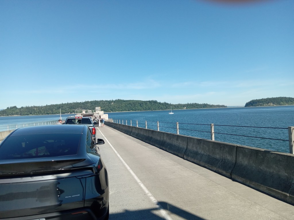
…traffic. Now, I love the vview from the Hood Canal Bridge as much as anyone, and, though I am grateful I no longer commute regularly to the other side, I may have a bit o an issue when, trying to get back, I am 13th in line for a bridge closure to allow a sailboat to get back to the north side. And then, under power, the sightseer takes his or her sweet time getting through the opening (Yeah, for tourists, the floating bridge is open when it’s closed and closed when it’s open).
Meanwhile, cars and busses and Walmart semis and Amazon delivery vans and tourists and I are waiting. I shut the engine off (many didn’t), called Trish, and said I really wanted to get close enough to yell at the sailer, not that I, even with my lost at sea. voice, could. “No, no, don’t do that!”
Okay, but, maybe, there should be a… dealie; like, if you’re enoying the splendors of the wilder lower canal (for tourists, it isn’t a canal; there’s an end. Waterway cul-de-sac), you should stay until… I don’t know, not Monday morning when workers need to get to jobs.
I guess one brighter side is that I was on the bridge, and not stuck behind a tour bus-sized motorhome pulling a Mad Max rig, that rig holding the electric bikes and Kayaks, and, worse, surfboards. I was packing ladders, so… that might make me a tiny bit jealous. Maybe.
Meanwhile, I finally posted a Dylan 85th birthday video I filmed a couple of weeks ago. Find it on the gram at realsurfersdotnet. Like, comment, follow. Not mandatory. I’ve spent too much time scrolling and commenting; sniping and attempting cleverness. It’s not (for tourists) real life.
Contact- erwin@realsurfers.net
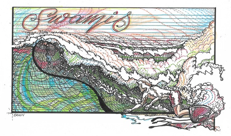
“SWAMIS” note- I keep thinking about subtle changes to my otherwise done novel. Because I am also trying to keep a bit of a journal on some dreams, I went to sleep in that ‘one more hour’ portion of the night/dawn considering the real life location in which I have fictional character Julie Cole living. It is across Highway 101 and the railroad tracks, up the hill, and offers a view of the entrance to the Swamis parking lot and a chance to see swells approaching. In 1969, the time in which the story is set, there was still a pullout adjacent to the park. Houses now.
In this dream, I am on that hill. I see waves, surfers. I tell Trish I have to go. Now. Now! I’m running down through the scrub brush, onto the gravel, across the tracks, and… I did warn you that it was a dream. I mean, me, running.
In real life, the last time I surfed Pipes, I did park up and above the tracks. I didn’t run.
NOTE- Dreaming about surfing is not a replacement for surfing. Following every real surfer on Instagram, also not a replacement. Still… part of surfing is imagining oneself… surfing. The harder part is getting there, getting out, getting in position, paddling… That.
Thanks for checking out realsurfers. If you can’t be perfect, be real.
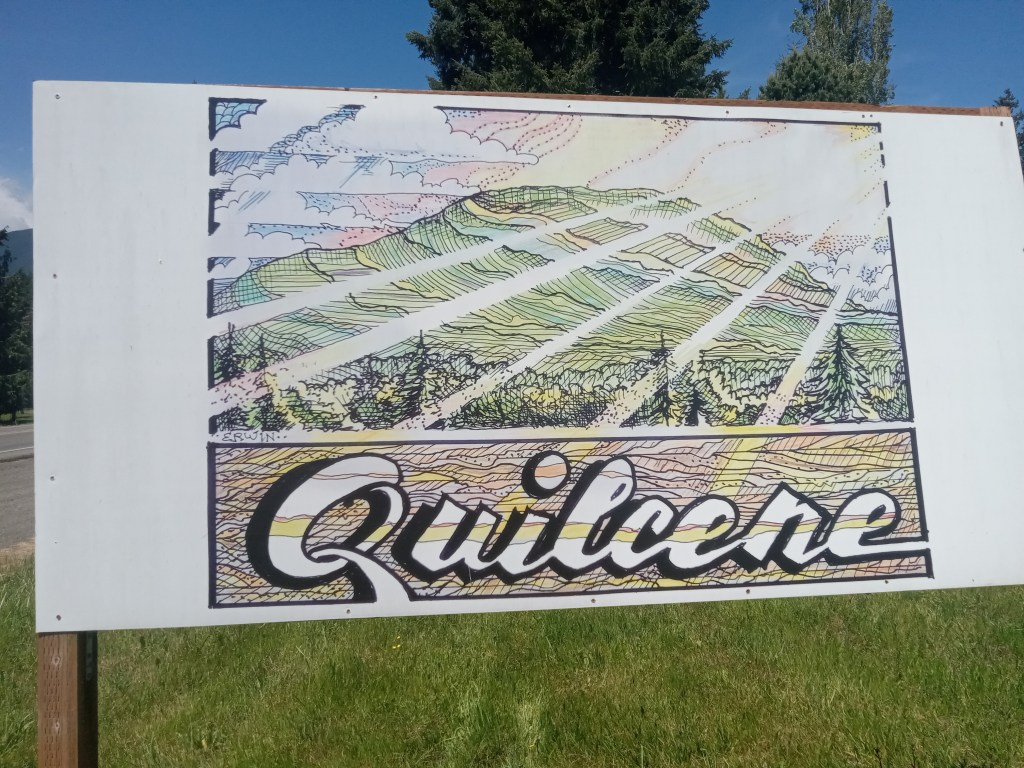
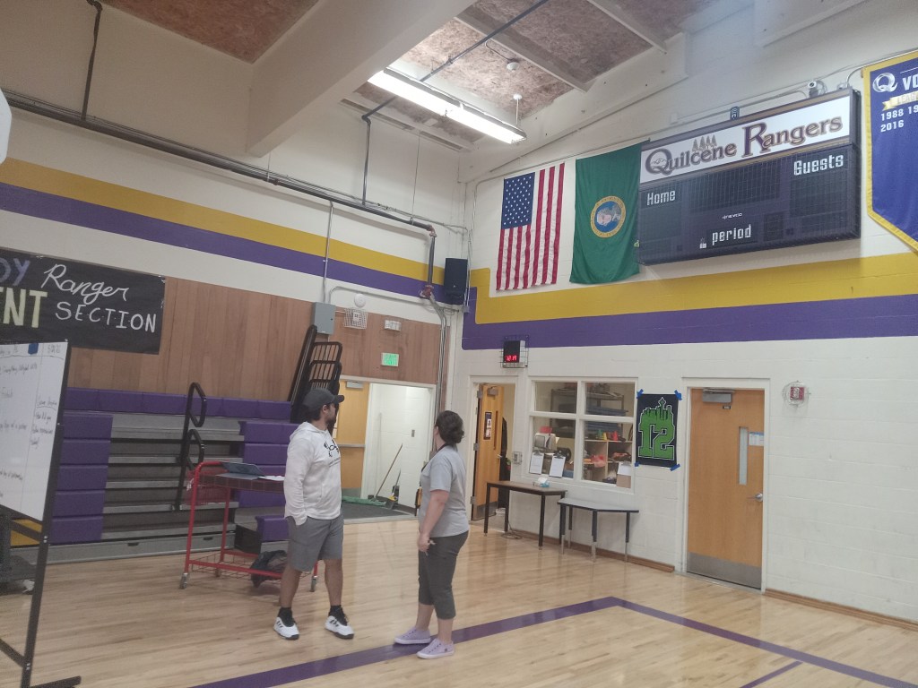
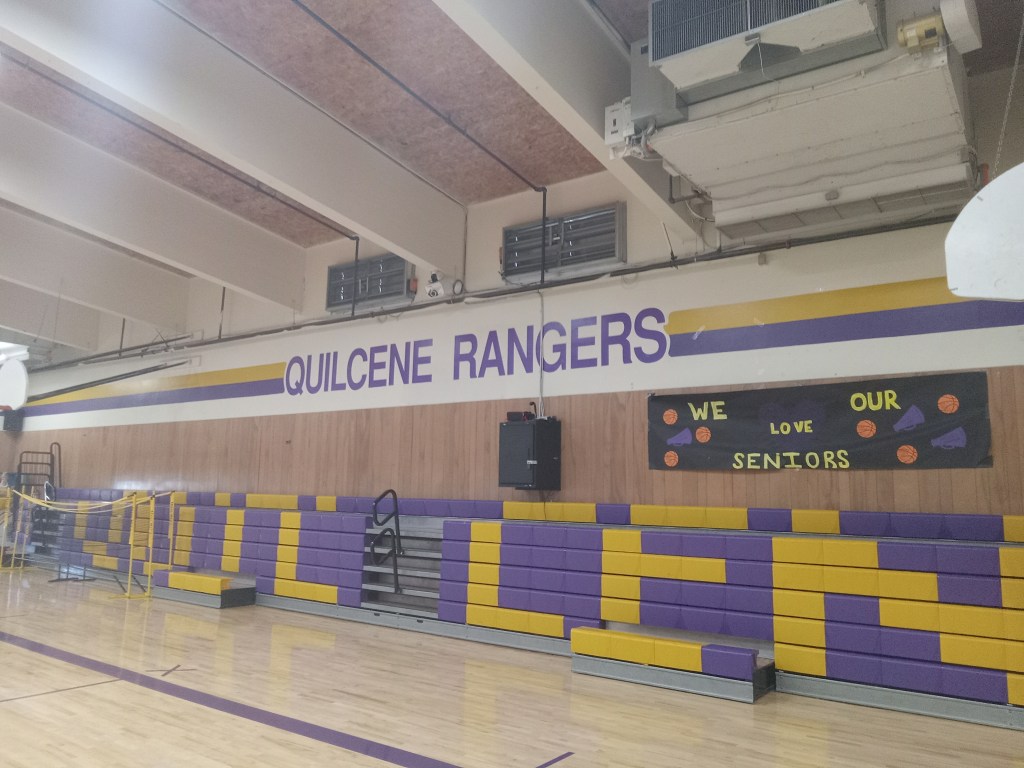
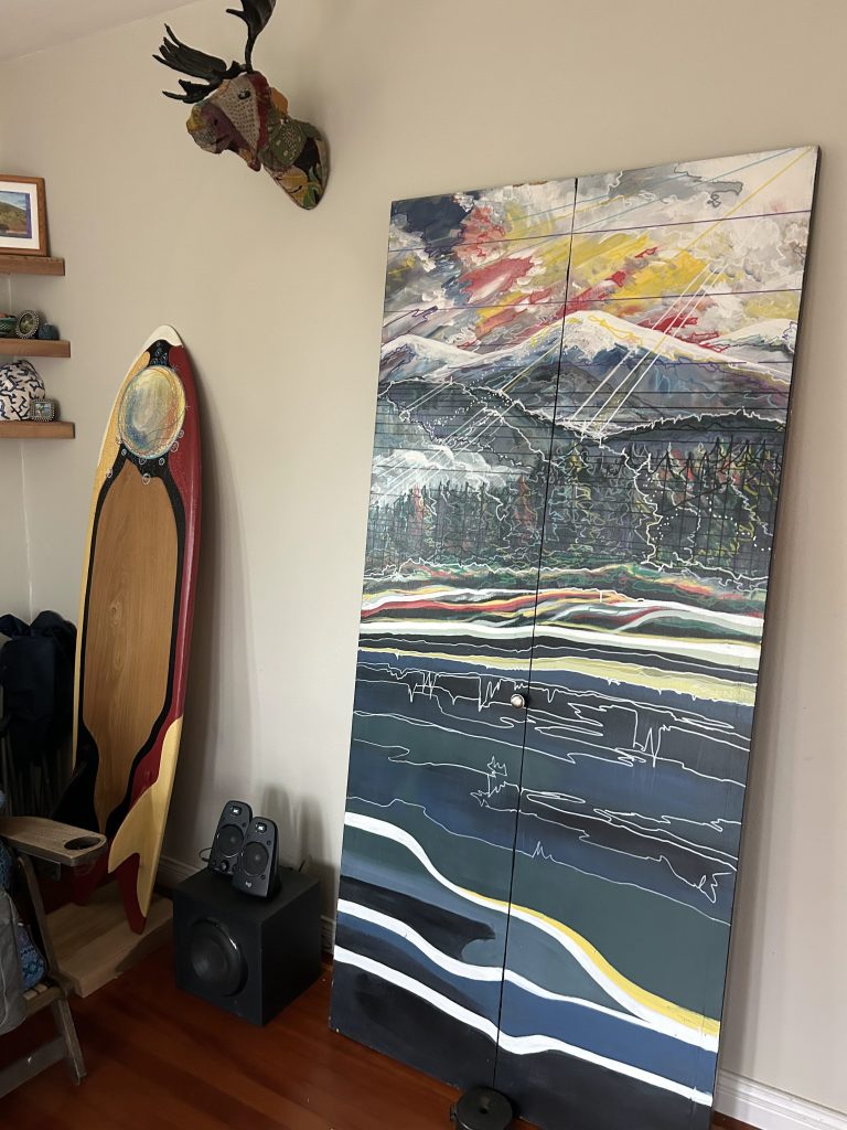
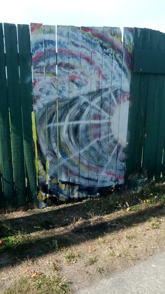
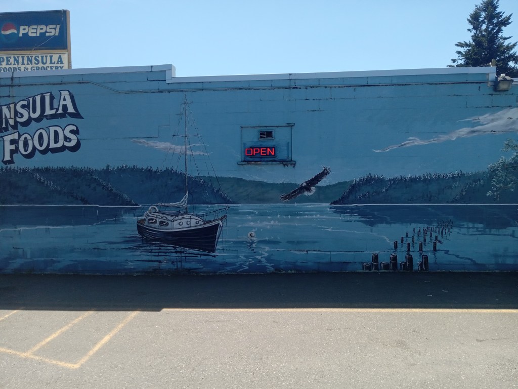
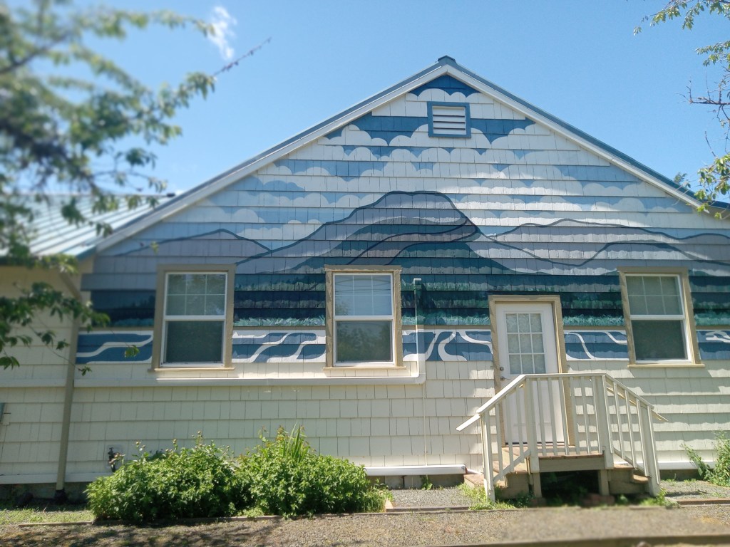
I included these as part of my resume’, that part of my submission for the mural project at the Seamus Skate Park in Port Townsend. It’s, top to bottom: Original sign on 101 originally done as a (winning) entry in a post card contest at the Quilcene Village Store; rainbow on. gable of house on San Juan in Port Townsend; stripes and lettering in Quilcene gymnasium; surfboard and panel in Joel Carben’s collection; fence at PT’s Memorial Field; repaint of mural on Peninsula Foods; original. mural on. the Quilcene. Historical Museum.
Restricted in the number of images, this was the entire portfolio, with, of course, stories.
I did write some stuff, because having a connection to the skater community seemed to be part of what the deciders were looking for, revealing my last century street/skate cred. Skateboarding, for a kid twenty miles from Oceanside Pier, slaloming down the hills of Fallbrook, was so much a part of my surfing that… Yeah, I’ll get back to you on that, including my experience, in my twenties, living in Pacific Beach, San Diego, with the resurgence of skateboarding.
MEANWHILE, I’ve added another page to cover stories and dreams I really enjoy writing about. Check it out. I keep talking to strangers, keep dreaming, so… more stories.
Contact- erwin@realsurfers.net
InstaGram- realsurfersdotnet
Trish Update- Slow recovery, stronger everyday. If she has some chemo fog, so do I. Fuck Cancer!
Thanks for checking out realsurfers.net, see. you out on Surf Route 101!
I have done a few drawings lately. I need to get them to a print shop to reduce the size to work with my printer/scanner. At least one drawing is for a potential Original Erwin coloring book. Several are for a potential collection of poems and essays, “Love Songs or Cynics.” To that end, I contacted Port Townsend’s new Poet Laureate, and got her permission to send her some samples of my writing. The goal, for me, is to get some traction within the communty of serious writers.
Traction? Serious writing? What the fuck do I know about any of this? “Swamis” is done. This version. I haven’t looked at in a while; and I keep thinking about little changes I should make to make it better. Sellable. Marketable.
I am, meanwhile, trying to process not making the top three finalists among 17 submissions for a mural project at the Seamus Skate Park in Port Townsend. I wanted the opportunity. There is a ridiculous amount of money involved. For artists, almost all of whom paint and draw for little or no money, little or no recognition, so much of what is produced getting a quick glance, maybe a nod, this is a rare offer.
There’s a story of what was required in the submission process. To this point, the emphasis was not on ideas and visuals for the murals but on experience in doing this type of work. I believed, or wanted to believe, that 57 years (as of yesterday) as a professional sign painter, regular painter, might help. But, not having initially read the entire requirement page, I went full on into thinking about possibilities, doing sketches. Then, with so much help from my daughter, Dru, I worked on my resume’.
Again, processing; I got the email late last night. So, whining. Apologies. Submissions. Submitting, by definition, means you are being judged, that you have no control. No, it comes down to what is being judged. Part of the deal. Not good enough. Not what the deciders are looking for.
So?
So… I have to go. There’s a house to paint. I submitted a proposal, as I do, and, yeah, I got another job.
I’ll get some new stuff on here. Soon. Thanks for checking out realsurfers.net
I’m almost finished with this sign down Linger Longer Road in Quilcene. Suddenly, the town on Surf Route 101 I’ve lived in almost 48 years, is hip, cool; hip and cool go there. On purpose. And, with rich folks building mansions on Olympic foothill acreage, there has been an influx of a young demographic.
You can cruise on the massive, wonder of a bridge, just opened, that goes over the remodeled lower stretch of the Big Quilcene River/flood plain, cruise along the mud flats of Quilcene Bay (filled in at high tide with water warm enough in summer to allow swimming sans wetsuit), and, just before you get to the oyster hatchery and Herb Beck Marina, check it out. Am I trying to blow up the spot? Maybe.
If Surfing Fills a Hole…
If surfing fills a hole in your life, possibly in your soul; if your self-image and the image you’ve worked for and work to project is that of a person who surfs, a surfer, with any and all of the real or romanticized attributes given, and appreciated even by the most random, holiday surfer; if you live for and lust after waves, fun-sized to crazy to death barrels; if you are that person, and you can’t surf for a while, as in longer than it took for you to recover from this or that medical setback, or a work or situation-caused injury that required time away from waves; if you cannot surf… what fills that hole?
Stories of past glories are not enough. Enough retellings of even the most mundane tales of riding spots now incredibly crowded on even an average day sound exaggerated. Or worse. Even surfers your age might question whether your authenticity. Young surfers will dismiss you and your tales, just as you put little faith in the stories told by people over thirty when you were under twenty.
Still, people riding emptier lineups, even on pre-revolution boards… that’s something. Memories have value. Times edits out those that don’t.
Yeah. I’m writing about surfing instead of doing more surfing. I have excuses and explanations and situations, and, mostly, or partially, I have a lot of other things I have to do; most of which interfere with other things I want to do.
Surfing is on the ‘want to do’ list. There is that hole, that desire.
“When I was younger,” a sentence begging to be ignored or half-listened to begins, I was critical of surfers who weren’t frothing to go out on waves I couldn’t resist. But then, and now, I tried to adjust my life, or, at least, my schedule, to allow the opportunity, and, non-epic waves, enough of them, with, maybe, that one sneaker barrel… worth it.
Most of my contemporaries are not surfing. Kudos to the ones who are.
A good friend, legendary (I try not to over or misuse that description) gave up (not ‘quit’) surfing a few years ago. Bad shoulders, bad knees, crowds. Age. Mix and match. He told me that he says, if asked, that he loves surfing, always will, but, luckily, he has a lot of other activities and responsibilities that keep him occupied. He may have said fulfilled.
Still, I have seen other, most-likely retired folks, and this was a while ago, at Pipes, hanging on the fence, looking at other surfers paddle and bob and blow takeoffs and ride awkwardly, and I thought how lucky they were. Then Ray and I walked down and paddled out.
The hole. I am fond of thinking that it’ll always be there, as filled in as best I could; still anticipating the next session.
Lucky me.
Contact- erwin@realsurfers.net
Instagram- realsurfersdotnet
Check out the other Pages, including the newly-added PAGE VI, a collection of my original art works. I have been working on a collection of poetry/songs/stories, with a plan to publish it. Soon.
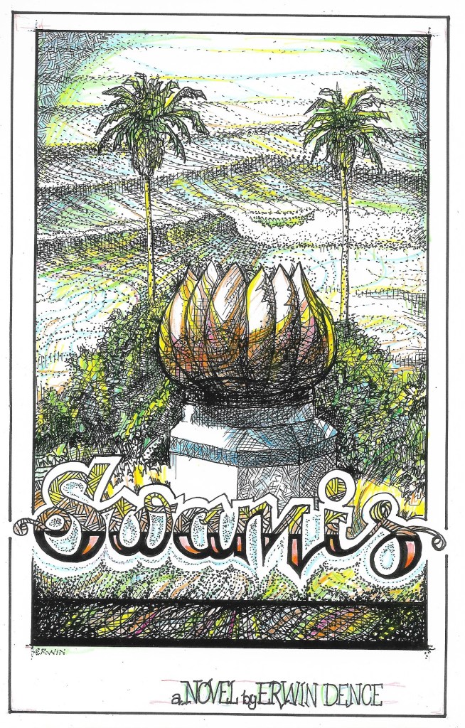
I have a new copyright for “Swamis,” the novel, mostly because I’vve gotten a bit more protective, partially because it is so different than the draft currently copyrighted. The above story is, as all original works by me, protected under copyright, all rights reserved by Erwin A. Dence, Jr.
Thanks for checking out realsurfers. Get some waves, make some memories, live your own story.
Since I’ve been hearing about other people’s surf experiences more than enjoying the planning and anticipation, the search, the wait, the finding and enjoying a session way better or less better than imagined; the chance to be the one bragging, gloating about, or merely and factually reporting on the score; all o which means. I’m dreaming more than realizing, I think I should add a page for dreams; a dream journal if you will. I you won’t, I still will.
I’ve had so many dreams in which I am frustrated in getting to the beach. Normal, I guess. I have had numerous dreams in which I’m driving through woods and swamps on crappy, one lane roads, only to get to a section that is. impassible or requires driving over a log bridge. Imagine 112 anywhere west of Joyce. I had two of these category dreams last night, sort of connected. In the first, there’s a giant cement structure to my left, with, some unseen shotgun rider explaining the surf, also unseen, is on the other side. “Keep driving.” Ine second. dream, I’m trying to pull into a muddy, dark road, and there are headlights coming down and around a corner. Lots of speeding vehicles. I gun it, the copilot screaming, go up and around a corner, and… and, and, there’s a school bus, red lights on. Stopped.
Wake up.
I do self analyze the dreams before they vanish like morning mist. Yeah. Fucked up. I’ll keep my assessments semi confidential. YOU’RE WELCOME.
BUT, here’s my inaugural piece: II can explain, sort of, the line throughs: I was using a different computer, tried to save it to a thumb drive, and then, out of nowhere…
IN DREAMS
In dreams, it seems, we are attacked by the monsters we blink away when we are awake. Dream demons come from the shadows, from the hidden spaces, the windowless rooms, the caverns and the taverns, the back offices; they emerge from the deep woods, the grown over pools, the long and lonesome highways, places we know they inhabit; but the dream dwellers also appear at the laundromat, at the market; grinning ghouls, leering carnies, hawkers and grifters, preachers and politicians, and… most frightening, we are joined, greeted, casually, in some public place, by people we no longer know, people long deceased.
These specters are not frightened; we should be. We are the strangers in this realm, dropping in and shaking ourselves out.
Alternate world, or overlapping orbit, or separate track in our overwhelmed brains, we are told that dreams give us the opportunity to work out problems our conscious minds cannot. Work out, possibly; solve, probably not.
In dreams, we sometimes believe we have solved… something; only to realize, as the gauze and the glisten vanish, that the shadows are still occupied, our problems are still real. And, in the open, in the light, one terror remains; some thought that something so disturbing, so contrary to our daytime logic, is real.
I do, in real life, have a barn. We once, years ago, had pigs. It is not true that we have pigs in the barn, hungry, squealing; it just, sometimes, in a certain half-light, half awake, not fighting other ghosts, seems as if they are real and squealing for me. And I had better hurry.
My novel, “SWAMIS” is done and I have done nothing toward selling it, but I will. I mean, it’s been years getting to this point. PUBLISHERS, AGENTS, and, really, anyone who wants to reach out on surf or any related issues, it’s erwin@realsurfers.net Not editors for hire, however. No offense.
I do, occasionally, put out stuff on YouTube. realsurfersdotnet I DO SPEND/WASTE too much. time on the site, meaning, yes, I like and comment, and then. look if I get a response. Because I do, my commentary obviously. clever, I. spend/waste more time. Or maybe. it’s spend/waste/invest time.
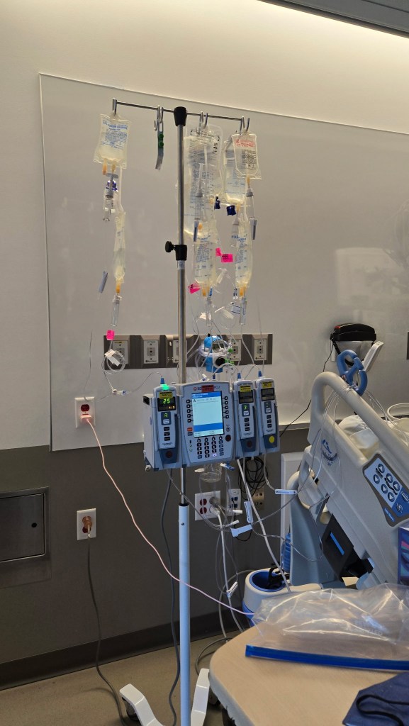
TRISH UPDATE: 21 days in the hospital, she’s back at our daughter’s (DRU) house, slowly, slowly, eveer so slowly getting better. There’s a formula for how much time it takes to recover from hospital stays. It’s more than one to one. AND I’ve been told to be patient. Numerous times by numerous folks, Trish foremost among them. Trish is determined. I’m optimistic, I’m ust not all that… patient.
I ALSO need to do a page of my art stuff. Yeah, yeah, I will. Soon. Really. Patience.
Thanks for checking out realsurfers; hope you overcome the obstacles and get some tube time.
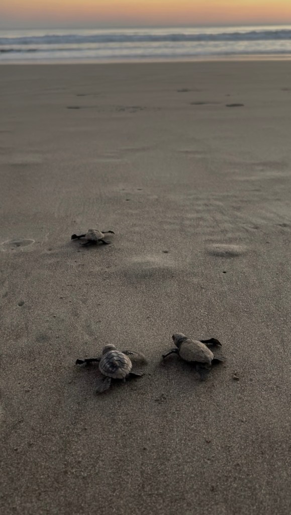
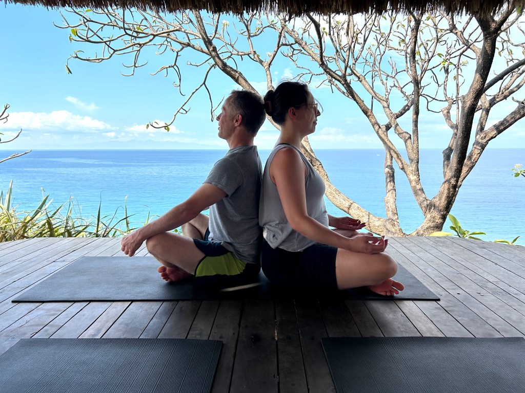
Actual text from Chris after the surf/yoga/actual honeymoon to some resort-like place in Central America: “Okay, here’s your dispatch from the field. The crowds you feared are a non-issue. I’ve had multiple solo sessions and only one with more than 5 others. The biggest issue with locals was the crocodile that was in the lineup two mornings in a row. I surfed 20 sessions across 4 spots, including some epic ones that involve a hike in. Lots of great wildlife, as expected, including a sea turtle hatch and lots of loud monkeys right outside the window. I did not see anyone SUP surfing on their knees- those niches remain open here. There were people taking lessons out front, but they were not in the way, and they were fun people. The waves were pretty big for part of the trip, so they mostly went to mellower beaches elsewhere. I did have a chance to meet the local version of Keith, who takes it to another level and sleeps in a hammock on the beach. He tends to the local turtle nursery rather than a library. The local Erwin is an opining yoga instructor who paints sunsets. All in all, a great trip, and looking forward to getting back in the water with the PT gang.”
Gang is right, from what I hear. It must have been in conversation, maybe in person, that, both of them being marine scientists, Megan was especially excited about a sea turtle hatching while they were there.
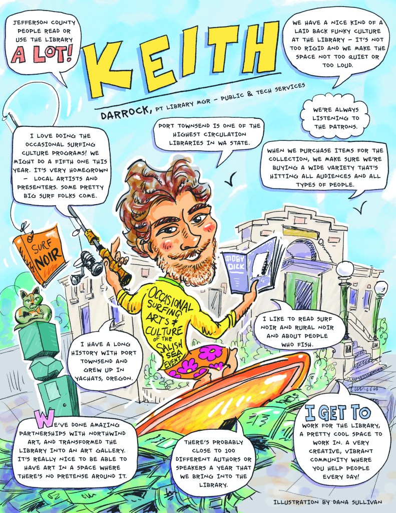
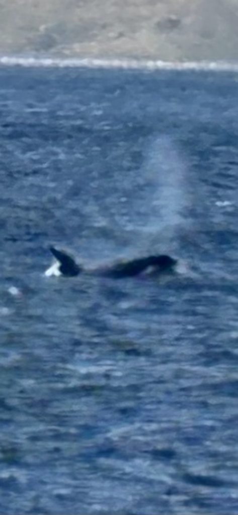
Speaking of KEITH; a flyer for the library featuring him, a photo of an above-average day on the Strait, newly painted rails on a board he got from JOEL CARBEN (also provided/sold Chris some snorkel fins that came in handy down central), a slightly out of focus ORCA checking the surf, and a flyer for Reggie. No phone nNot that hard to find.
I’m not allowed to post any photos of TRISH. I am putting this together in her room at SAINT MICHAEL. She is very committed to getting the hell out of here. Friday for almost sure. The farther we get from the original admittance, the more we (especially our daughter DRU and I) realize how dire her condition was when she was admitted.
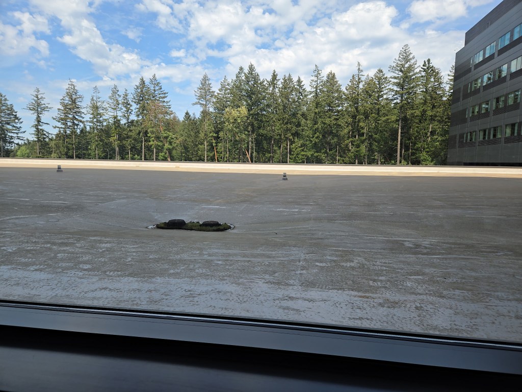
The view from the ICU is the worst. Most views include the Olympics. Speaking of mountains, SHORTBOARD AARON LENNOX, surfer, climber, professional rope worker, has been doing some work, or having some scary fun, or both, near this top secret location.
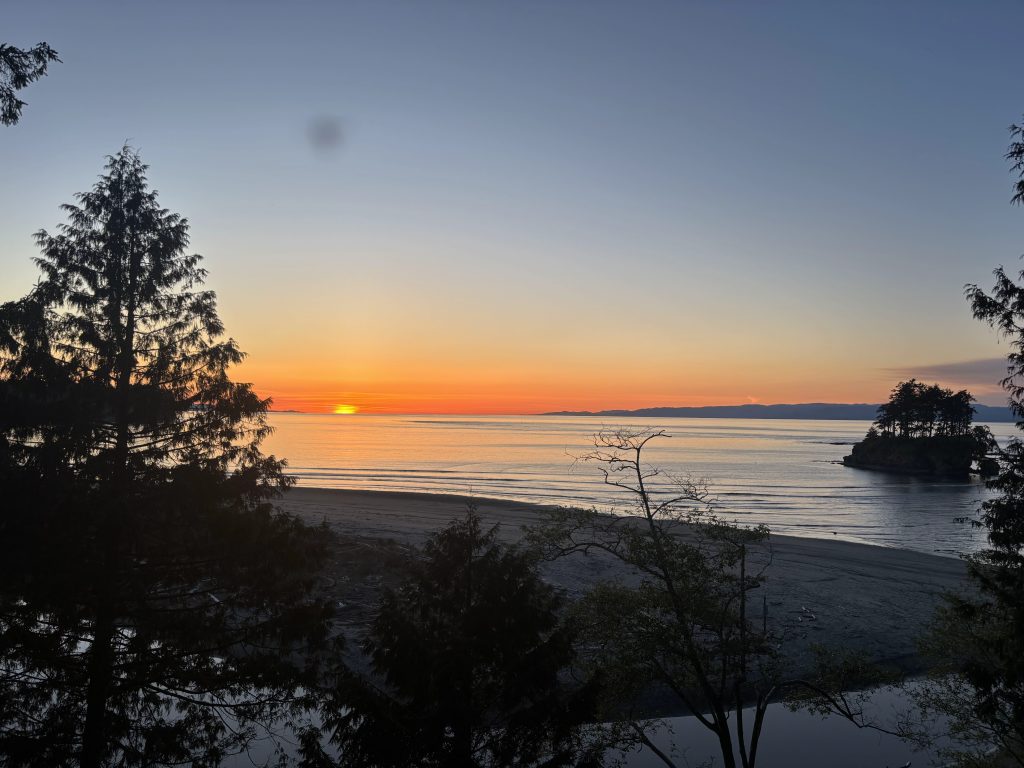
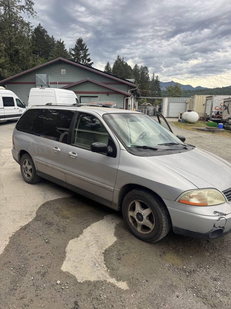
Just to round this all out, the photo above, on the Olympic Peninsula, was taken by ARLENE OPTINERIO. And here is a shot of the rig ADAM WIPEOUT JAMES IS ‘practically giving me’ to replace my much-loved VOLVO (I do plan on getting it fixed). It’s a stealthy WINDSTAR that once belonged to CLINT THOMPSON, who also owned most of the used surfboards now owned by others hereabouts. IF I haven’t dropped your name here, send some photos, artwork, stories to erwin@realsurfers.net and I’ll give you the same amount I gave Chris. That and the knowledge that tens of real surfers, worldwide, are checking it out and scrolling on.
I have some other projects in the works, and, a reminder, “SWAMIS” IS DONE, MAN, and I need an agent, producer, publisher.
ALSO check me on INSTAGRAM, realsurfersdotnet AND check out the other pages here. AND surf when you get the chance, work toward having more chances.
I do have some content in the works. I’ve been kind of… No, I don’t like excuses. You don’t need explanations.
As an update, TRISH is ready to get the hell out of the hospital. Her numbers are all getting back to the normal pre-cancer, pre-chemo, pre-radiation levels, and she is ever more determined, Again and always, fuck cancer! She is, finally, getting stronger. We can now see how critical her situation was.
I do need an agent and. publisher for my *COMPLETED novel, “SWAMIS.”
*OF COURSE I want to do just a couple of minor tweaks, not that. I’m, like, overly anal retentive. IF YOU WANT IN on this, contact me, erwin@realsurfers.net Or for any other surf related beef or content or submissions of stuff you want posted for free for my small but worldwide audience.
Meanwhile, I am putting art and music on Instagram at realsurfersdotnet and doing way too much commenting on other people’s stuff. Because I care. I have a new poem, “VISCOUS,” on PAGE III. I am considering adding another. page for original artwork. Not yet. I will let you know.
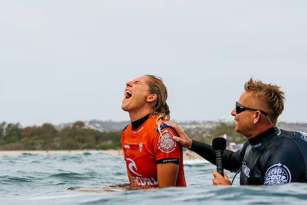
I DID WATCH quite a bit of the most recent WSL event. Two things: This surf competition is BRUTAL! STEPHANIE GILMORE is the QUEEN, and, evidence seems to show, she seems to know how to celebrate.
SAN CLEMENTE, CALIFORNIA – SEPTEMBER 8: Seven-time WSL Champion Stephanie Gilmore of Australia after winning the World Title at the Rip Curl WSL Finals on September 8, 2022 at San Clemente, California. (Photo by Pat Nolan/World Surf League)
Different contest, same winner. Thanks for checking out realsurfers.
I DO HAVE surfing related content to post, but I’ve other things going on that push this stuff back a ways. As do we all. Other stuff, like real life. Trish has had a terrible time recovering from chemo and radiation, and has been in the hospital for almost a week. Weight loss, low blood pressure, some sort of infection, it’s all been quite overwhelming.
THE THING ABOUT much of life is that there are, yes, those moments in which something happens suddenly; car accidents for example; but most things happen in much slower motion. Sometimes painfully slow motion. Hair loss is one example (not the best if you consider chemo), but all the indignities dealt us in the aging process. AND THERE are the many problems and issues we cannot fix. ourselves, even with YouTube video help: Car repair. Cancer. AND THERE is the (almost) guilt we feel when we can do so little to help others, this hopelessness (if I haven’t mentioned this emotion yet), the ‘almost’ hopelessness and guilt when we’re talking about people we don’t know, or don’t know well, the feelings multiplied when it’s someone we love.
I I’M COMPLAINING, and I am, I am also aware it’s not about me. It’s about TRISH, someone I’ve known and loved for almost 58 years; someone who doesn’t want me making a deal out of all this. Stubborn enough (and people do ask me… and Trish) to stick with me all this time. IF TRISH is stubborn, she is also strong.
THE ANNOYING reality is that life goes on around us. Bills come due, obds have to be completed, and there’s not much I can do hanging around in a hospital room. AND I AM SOO annoying. II do, however, have some abilities in raising Trisha’s blood pressure. I must shout out now, to our daughter, DRU. She was vital in persuading her mother, with a lot of push from ADAM LARM, childhood friend to two of our three children, and now a nurse (two side stories I’m not telling now) to get paramedics to check her out. No, of course she had to go. And. now…
NOW I’m home, Dru did. a second overnight (they kicked me out at 8:30), and I’m charging up the phone, hanging on, waiting to hear what the doctor (4th or 5th since the two in the emergency room) has to say.
I CAN go work, or I could go to SAINT MICHAEL, or I could work on this blog, or I could finish the ending for my novel. The last two pages have been ready for a while, waiting for my cluttered, disjointed mind to focus enough to come up with… something… perfect, something that ties up some of the storylines while hinting, not subtly, that the next book, “BEACONS” (like Swamies, a convenient surf spot name that reflects the characters) will continue the fictional story of love, marijuana, surf, and MAGIC in the real world, 1969, San Diego’s North County.
LIVE ACTION- It’s almost 11am on Saturday, and I got the latest. UPBEAT, waiting for this test result. Or that one. Antibiotics. Waiting. I need to make a decision. But first… finish this.
My plan was to write something on how. so many things in REAL LIFE take precedence over surfing: Family, work, emergencies of all kinds; bbut when I went to Microsoft Word and checked my file for my novel, it had the little arrow allowing me to. go to page 229 (of 229) rather than scrolling down (which I wouldn’t have done today), SOOOOO, here we are.
-HERE’S THE PITCH! “Swamis” is for sale. I NEED AN AGENT! I NEED A PUBLISHER! I DO NOT WANT an EDITOR-FOR-HIRE. If you are a LEGIT agent, or someone interested in publishing, or, perhaps, investing in some sort of self-publishing scheme, contact me, erwin@realsurfers.net
I SHOULD MENTION THAT “SWAMIS” is dialogue heavy and could be visually… compelling.
OR, I’VE long considered printing some very limited copies, offering the signed work (probably 8&1/2 by 11, with illustrations, signed, dated, numbered) for some decent price, to the most discerning investors and/or surf novel fans. I’m trying to ome up with a price. I will.
TRISHA, checking me out in 1969, with what might be perceived as an adoring look. More likely, it’s curiosity rather than amazement. I’ve been thinking about some sort of poem about what she means to me. Everything. She is my buoy and my anchor; keeps me afloat when I’m sinking, keeps me closer to reality when my imagination overrules my judgment. The anchor simile is tougher. I don’t always want a real life perspective. Nothing replaces honesty. It’s a key ingrediant in love.
Working. on it. Check out some other realsurfersnet pages when you get a chance. Oh, and I sometimes post on INSTAGRAM, realsurfersdotnet
I think Fast Eddie Rothman is saying, “FUCK CANCER!”