Art for Art’s Sake and Other Issues

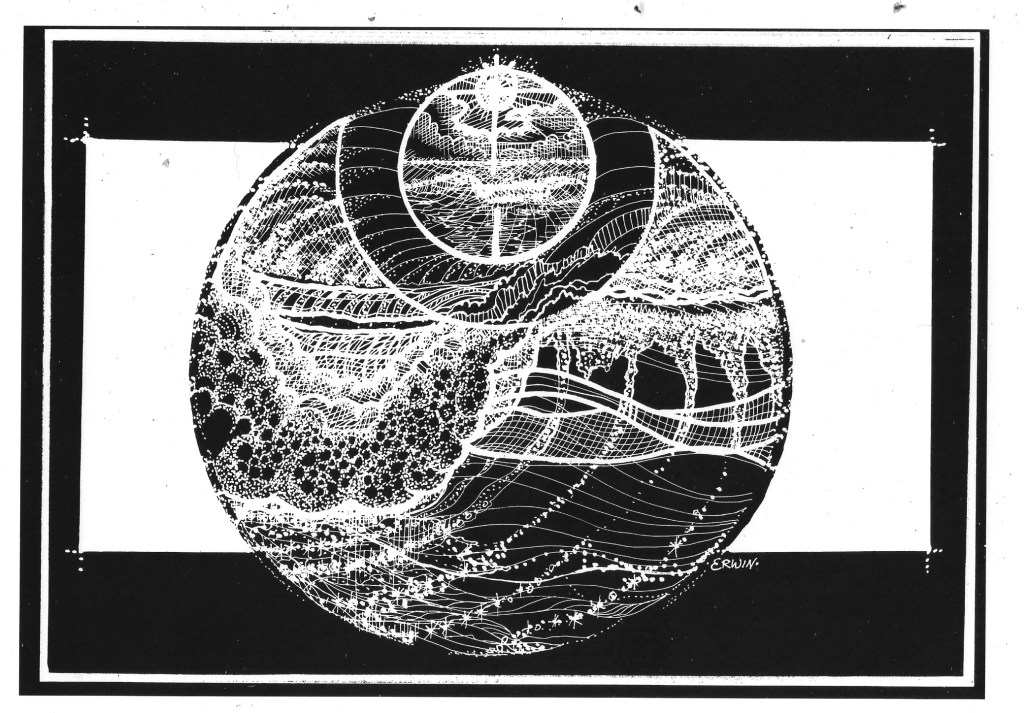
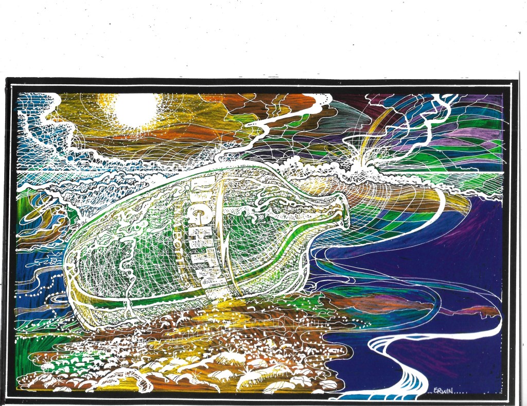
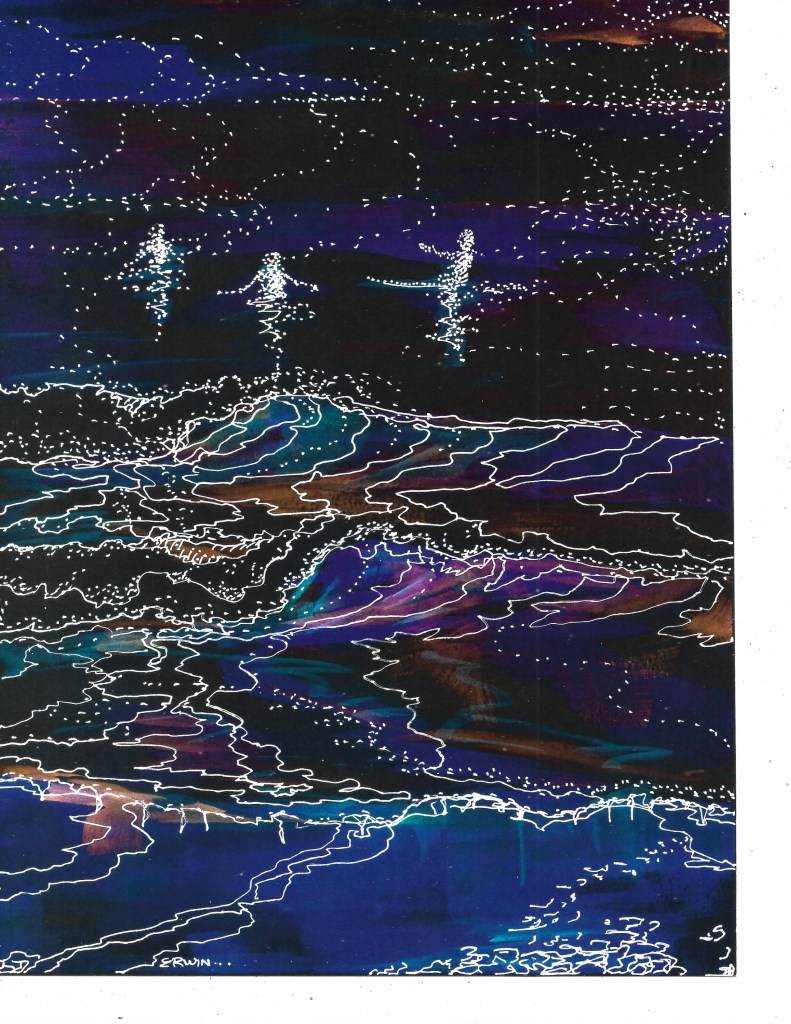
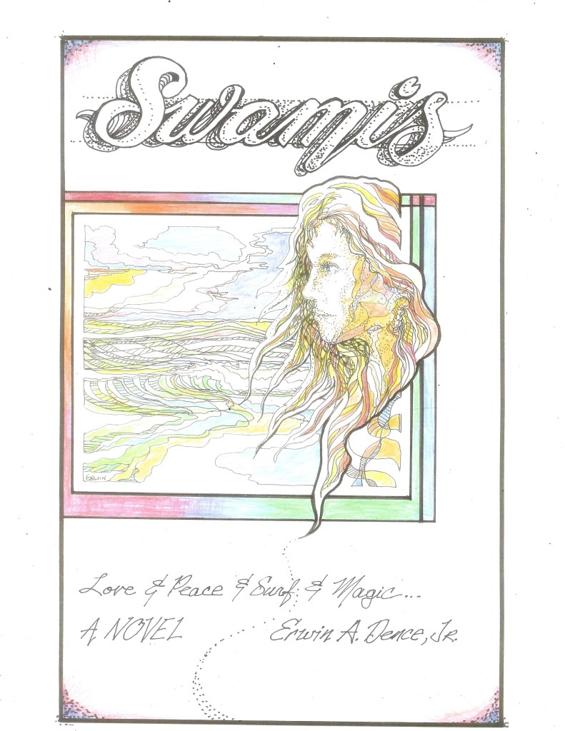
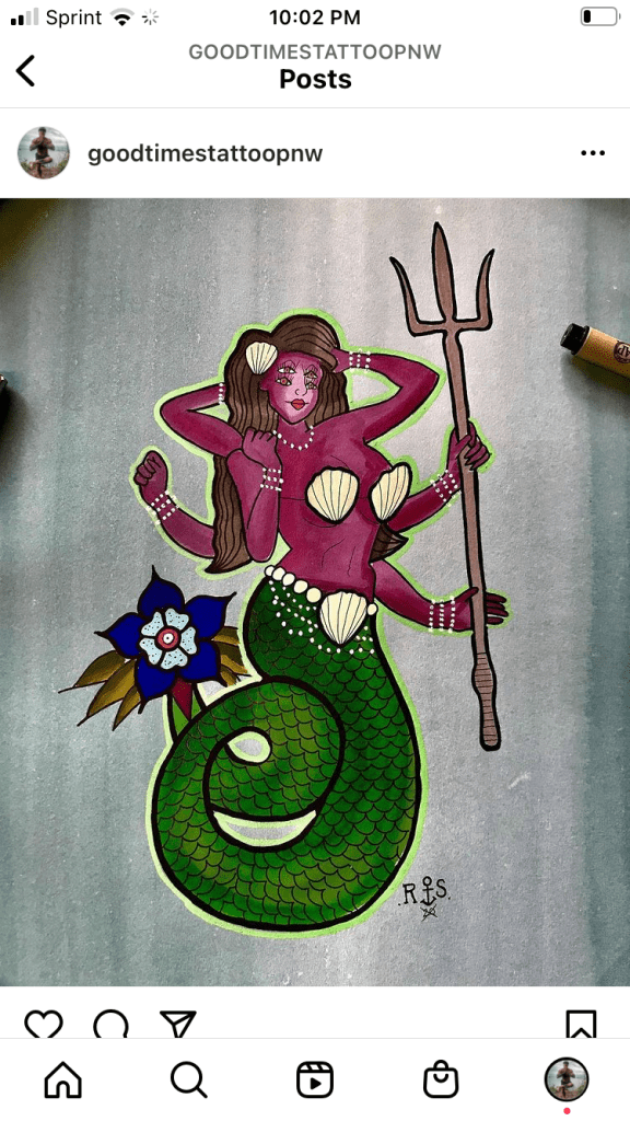
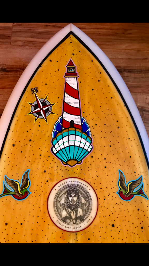
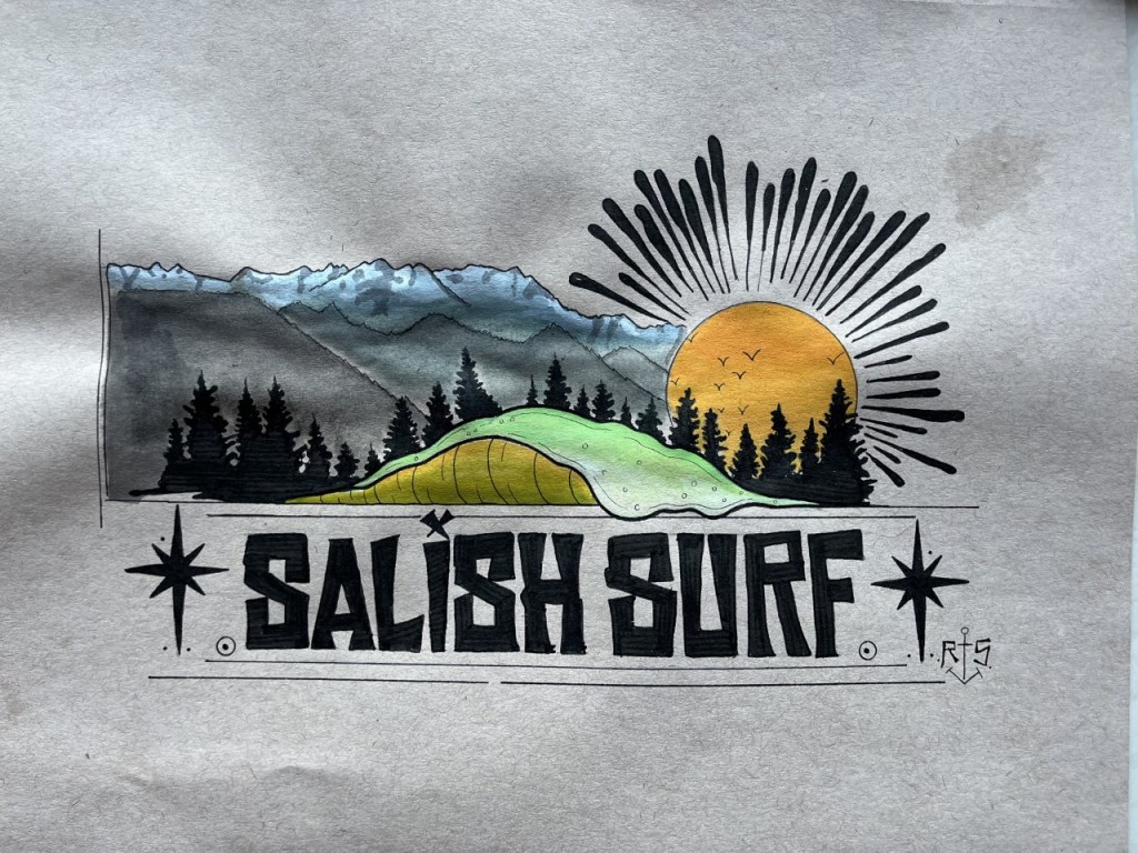
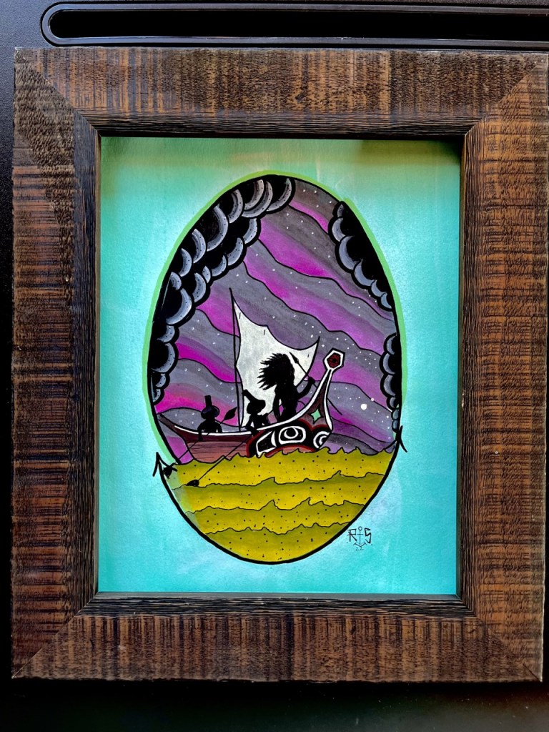
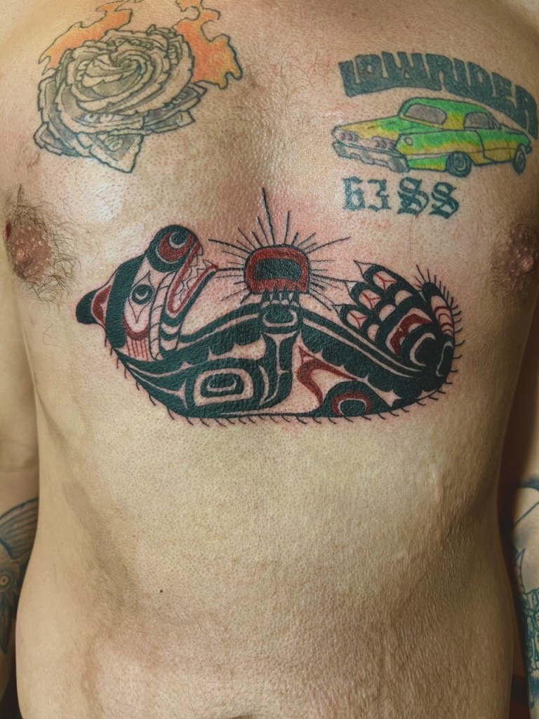
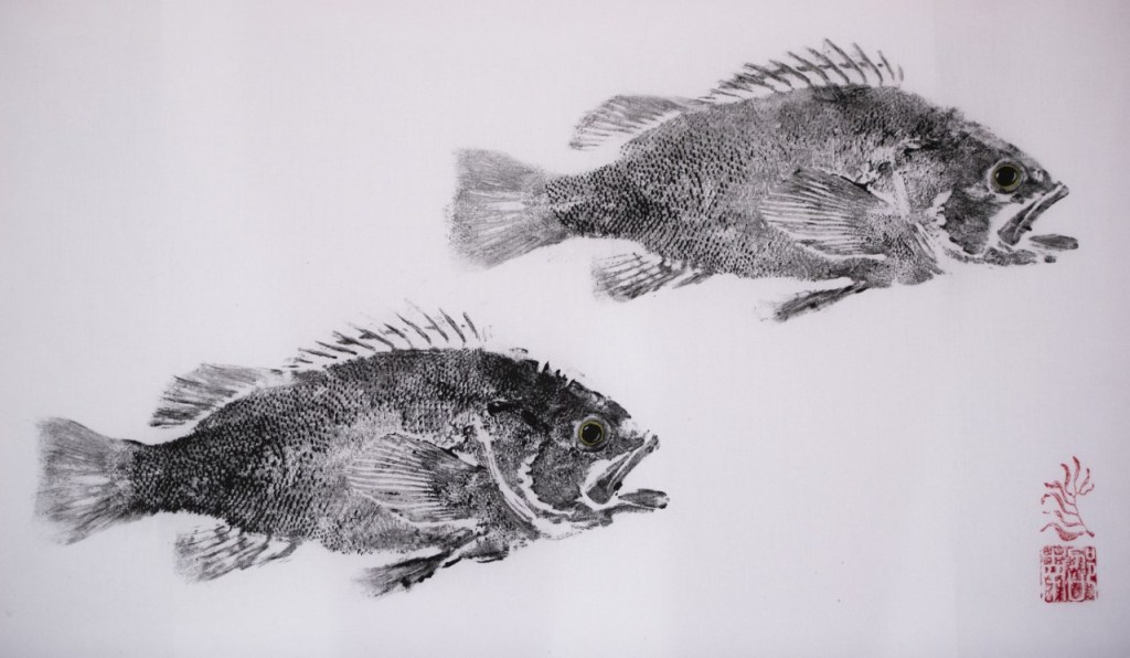
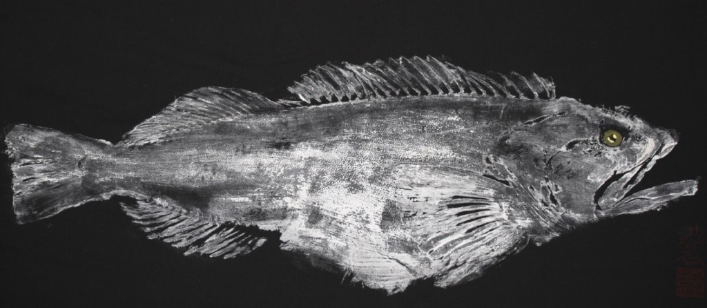
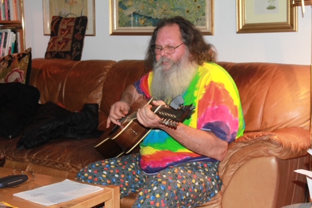
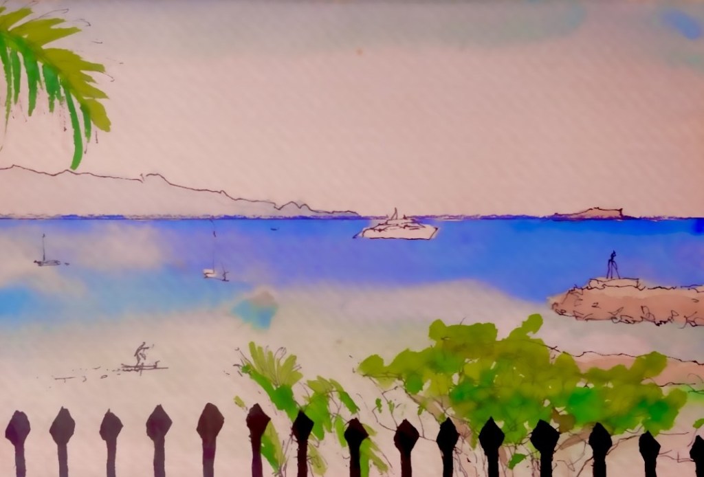
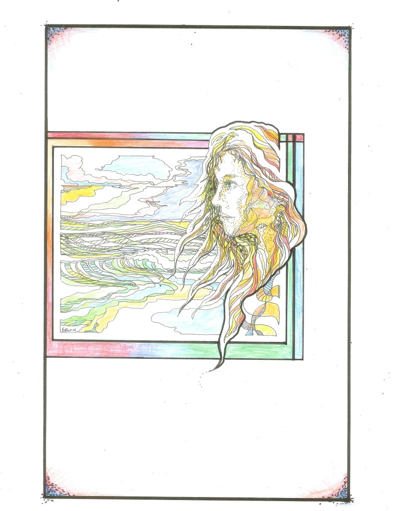
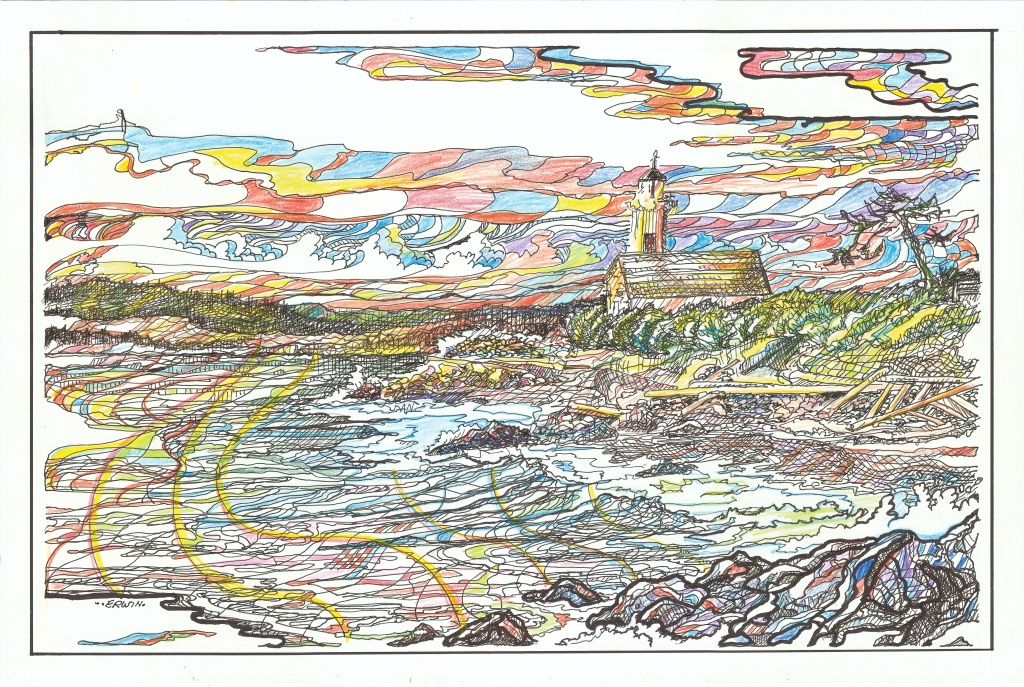
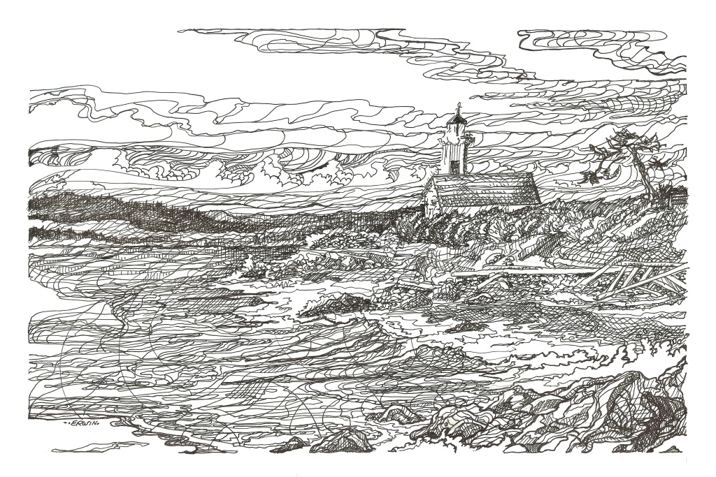
These are some recent works I didn’t think I had scanned. OR I believed they were scanned as PDFs, something I couldn’t transfer. I SHOULD, perhaps keep the line drawings for some possible future edition of a realsurfers/original Erwin coloring book, particularly since I may tend to over-color drawings that were, possibly, overdrawn in the first place.

MEANWHILE, I got some bad news on an art project I have been working on; basically, that the process was not set up correctly, paperwork-wise, and when I sent a bill for services (and illustrations) rendered, there were issues.

ISSUES. I HATE ISSUES. If I say getting paid is the reward for my labors; contemplating, sketching, drawing, revising, redrawing; and is temporarily gratifying, the money just a part of a cache and mostly spoken-for dollars, having issues in collecting the reward substantially reduces the JOY.

NOT THAT I don’t enjoy the prospect and the actual work of doing an illustration for some amount of cash. I DO, even as I realize I can make substantially more money per hour scraping and priming and painting someone’s house. AND I do factor in that it is not painting season.  

THIS SETBACK has given me pause to consider (not for the first time) why the hell I insist on pursuing some life outside of the scraping and priming and painting.

SO, I DID what I do; I wrote about it. Not all vitriol and grievance; rather I wrote a piece on how most folks who attempt to be artists want to please an audience.

AS DO I. Though I do want to please myself, with varying degrees of success, AND I have, indeed, accused other writer’s works (well, one writer, I confess) as being masturbatory; everything I write or draw or paint (including houses) is meant to be seen by, and, bottom line, to please the client and potential clients. I must add to this that a job isn’t finished until it is. I throw away so many more drawings than I display, I edit the shit out of things I write, and I go around and around any painting project doing what I call the “Tighten up.”

I realize that sounds, even as I write it, kind of queazy-ness inducing if not outright creepy. This isn’t me VIRTUE-SIGNALLING. No, I would love to be anything close to successful at writing and/or drawing, two things that have been part of my life, on and off, mostly off, almost all my life.

SO, I wrote the not-quite screed, but deciding to listen to Trish, I will wait and see what happens with the project with the issues. Meanwhile, I have other exciting projects/prospects on the ‘possibly fantastic,’ probably not’ scale. I should mention that I am really bad at waiting. If you’ve seen me in the water, you might agree.

BUT NOW, since I’m all calm and resolved, I’ll hit “Save” for the whole thing, stash it away for future check out if not use. Then, I will highlight this part and put it on my (yeah I’m resigned to calling my ‘site’ this) blog.

As my projects get sorted out, I’ll, of course, write about it… here.

AS ALWAYS, thanks for checking this out, and for respecting the copyright ISSUES with any original stuff. Whether I make any money or not from my work, I do reserve all rights to it.

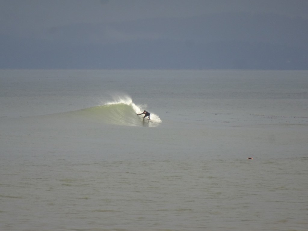
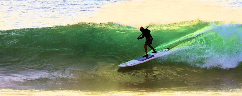
AS FAR AS WAVES on or around the Strait of Juan de Fuca, your guess is as good as mine.

Content with the Content? NO

Because it’s been preternaturally cold (I looked it up; it could mean ‘extraordinarily’ f’ing cold, as in, yeah, it’s been this cold before… in, like, Canada, Siberia, anywhere east of the Cascade mountains, just not lately), I have had some time, afraid, perhaps, to risk the icy roads (“I’ve heard of Quilcene,” the Facebook site our daughter, Dru, started, and Trish helps monitor; had reports of multiple cars in the ditch… and, perhaps, you remember I totaled a car against a tree in black ice two years ago, and, since, have become, I admit, less willing to assert my mastery over slippery roadways), and, anyway, someone has to run around and make sure no more pipes freeze up; BECAUSE OF ALL THAT, and the fact that folks don’t really think about house painting when it’s like this…

…I have had some time to work on my ART, on my NOVEL, on REALSURFERS.NET, what others always refer to as a BLOG. “I call it a WEBSITE.” “Yeah, you would.” “Yeah, and I do, and what I want to present to the tens of people who see it, is CONTENT.” “Oh. Sure. Content. What do you have?”

I HAD PLANNED to post images of recent illustrations, but, even after Dru switched the images of drawings from PDF to JPEG, they came out looking as if someone had placed a piece of frosted glass over them. SO, nope, I’ll get the originals back and rescanned. AND, though I wrote two pieces I might have used in today’s posting, AND wrote them in Microsoft Word rather than, kinda like LIVE, on the Word Press site, I, in the extended darkness of mid-winter night, under a thick pile of sheets and blankets, the heater set at “Roast,” decided they just weren’t good enough to share with you. WHY? CONTENT.

A drawing I didn’t think good enough to use on a t shirt, but, now that I see it after some time has passed; hmmm… maybe put a border on parts, and… yeah, that might be better.

WE, as consumers of ENTERTAINMENT, are constantly looking for BETTER CONTENT. If a TV channel doesn’t provide it… NOPE. We can scroll through the available options on ROKU, Prime, Netflix, whatever you or I have. NOPE; though I spent too many of my cabin fever hours watching one of those binge-worthy (the producers hoped) series(es?), the ending so rediculus (shit- Word has spell-fix, Word Press doesn’t), that I wanted my time back. I could have been doing something useful, like CONTENT.

YouTube; yeah, I’m a bit of an addict; surfing (I am caught up on Nathan Florence exploits, now fast forward paddling out sequences), politics (some I have watched LIVE, like Hunter showing up for sham committee and MTG acting… trashy, and when NSNBC stopped showing it, I, YES, watched some more on, yes, C-SPAN), some historical stuff that looks interesting (Bigfoot- not historical); OH, and I just discovered that, on my tablet (never on the laptop, but some surf stuff has been moved to the BIG TV), if I watch one of those quickies, I can scroll down and watch another, and then… another..

AND eventually, bored or fed up (which typically suggests some sort of anger), or SATIATED (seems more positive), or just OUT OF TIME, we… quit.

NOW, I do PROMISE new illustrations, several I’m really pleased with, and properly scanned, will be posted on WEDNESDAY. Meanwhile, the polishing of my manuscript continues. And, NOTE; I didn’t stop posting excerpts because they weren’t good enough, it was because the content is still changing. Of all the things I am involved in, in all aspects of life (other than surfing, where, still enjoying the hell out of it, I may have peaked a while back), what I’m striving for is to be… BETTER.

SO, other than all of the above (and Microsoft Word would give me a word count), no real posting today. STAY WARM, find some SURF. Oh, and, as always, thanks for checking out realsurfers..net

Merry Whatever You’re Celebrating, and…

…and really, not that much else. I hope everyone is getting some miracle waves, and… yeah, that’s about it. With all the shoreline around the world, a great wave is still a gift. Share a few. Surfers should have a bond built through sharing the experience of actually learning how to deal with a force as powerful and tricky as the ocean. Throw in crowds and rocks and tides and winds, all the variables, and.. yes, there should be a certain es-prit’ de surf… and sometimes it is lacking.

The difference between having a magical session and a go-out where frustration with other surfers, or lack of waves, or one’s own performance leads to anger, is so often, attitude. The mental game is as integral as wave knowledge. I have forgotten to have fun too many times.

My worst surf session, was, by any measure… valuable; in retrospect, great.

We made it past the dark solstice. Waves are in the forecast. Somewhere surfers will be enjoying the magic.

OH, about the ILLUSTRATION: I got this scanned at COHO PRINTING in Port Townsend. RANDY is so, so concerned about making the print better than the original. I totally appreciate it. I have done a color version, maybe a bit to psychedelic; but, since I have it on a thumb drive, I can have more opportunities to get it… better… not perfect… but…

HAPPY EVERYTHING!

Almost This and Almost That

Always trying to improve, I have decided (or am deciding) that the advice I gave lip service to years ago was, often, right. My commercial art professor treated drawings we students believed to be high art as sketches, with mistakes that could be improved with the next attempt, or the attempt after that. “Two-Coat” Charlie Barnett (I didn’t call him that until later) was right that two coats of paint is almost always the way to go. Maybe someone should have told me that nothing we write is perfect, even after multiple drafts. Art, life, surfing; ten point rides, ten point anything is rare.

STILL, we try. I tried for years as a sign painter to try to get my block letters perfect, only to be out-performed by computer technology. I try to please my customers by making their house look, well, as good as possible. Some are perfectionists. Great. Here is my line on that: Perfection is very difficult to attain, and impossible to mainain.

SO, and maybe it’s because I’m stubborn, I have put some more time into previous ‘sketches.’

SO, the first image is a possible ORIGINAL ERWIN t shirt design, totally redrawn after my first attempt. Because I draw these in reverse (white and black), I don’t really know how they will look until I go to the PRINTERY in Port Townsend. First one, guy’s arm too long, I didn’t like the lettering. This one… yeah, lettering doesn’t stand out enough. Maybe I’ll… yeah, probably a redraw coming up.

THE BOTTLE. On the top one, I colored in the white lines on the reverse image of the original white and black illustration. Second one, water-color on the original and then reversed. Third one, to show the difference; I used colored pencils on the original. I am quite excited about the process of reversing the color spectrum, but I think I went to yellow on a night sky because I figured out how to get it. Purple, darker the better.

THERE ARE, as always things I like about each of the attempts. Attempts. More to follow.

MEANWHILE, in preparation for the upcoming SURF CULURE ON THE STRAIT OF JUAN DE FUCA AND THE SALISH SEA EVENT, I am trying to get a collection of (the best of) my years of art stuff together and scanned, the hoped-for result a sort of powerpoint thing that can be displayed on one of two screens in the PORT TOWNSEND PUBLIC LIBRARY, 6pm, Friday, June 30.

At least seven other Olympic Peninsula surfer/artists will be displaying their work. I am planning on reciting at least two surf-related poems (actually songs, but I will try not to sing them). Other stuff going on, music, food, readings, are still in the getting-there phase, all under the management of surfer/librarian Keith Darrock.

MORE NEXT SUNDAY.

Remember that I do claim all rights to my work, perfect or not. THANKS, and by all means, get some waves when you can. Perfect or not.

Water-Color Adventures

Maybe I should just put up the images without explaining what I was going for and why I decided to do some water colors. NO, I should explain. Jealousy, competition, that sort of thing. I am very impressed by what TIM NOLAN has been doing with photos and watercolor. In particular, I was super stoked over some colors he used on a work I have not yet posted, BUT WILL. SOON.

AND, I do want to get some froth building for the upcoming THIRD OCCASIONAL SURF CULTURE ON THE STRAIT OF JUAN DE FUCA AND THE SALISH SEA EVENT, Friday, June 30, Port Townsend Public Library, 6pm. The event will feature story and music and art works by local Olympic Peninsula artists.

MORE INFO TO COME.

OKAY, so I am perfectly willing to refer to these watercolors as studies or sketches. The poster… um, I’m not totally stoked on it. Even though it is a surf ‘culture’ event, when you add people to the mix, the risk is of getting cartoony, which I kind of did. SO, I’m redoing the poster. The deal with three surfers in the glare was designed to put in the middle of a poster. The darker version was a mistake by Steven at my favorite non-surf, non-work hangout, THE PRINTERY in Port Townsend. I had just gotten a reversal done for the new attempt at the poster. SO… whoa! I like it. And what I liked about the color on the original, the splotches in the breaking part of the wave, I like the colors in reverse almost equally. Happy accidents.

THE BOTTOM two drawings are… okay, studies. I am working on (Today, actually) some other possibilities for new ORIGINAL ERWIN t shirts. IF you own one now, hang onto it. I, most likely, will not print more shirts with those designs. They are authentic and ultra-exclusive and, and… yeah, if I ever hit it big…

IN other dream scenarios…

HAPPY MOTHER’S DAY to all the mothers. I’m scrambling to get past my me-time and maybe buy something special for TRISH, the mother of our three delightful children. I mean, I do have a list: Toilet paper, paper towels, some vitamins, stuff like that. I’ll see when I get to Costco.

Oh, yeah; please respect the copyright restrictions on use of my, you know, studies and sketches, and… fuck it, why didn’t I go to the coast? The NEXT TIMES are piling up. But, yeah, next time, man…

Wednesday at Swamis

Check out Reggie Smart Art by scrolling down. I do plan on posting new stuff on SUNDAYS, but I might just have more stuff to say than one-a-week can handle.

I continue to tighten and refine my manuscript for “SWAMIS.” Every time I am happy with one chapter, I think about how I can cut some fat from another chapter. When I say ‘think,’ I mean obsess. Most of this chopping and hacking involves covering what characters do without going too far into some background on the character.

But first, without too explanation- A few new illustrations:

WAIT! I screwed up and didn’t switch the view on several other drawings. Not being skilled enough to save this and add the corrected images. I guess I’ll have to save them for SUNDAY. SUNDAY!

MEANWHILE, here is a section that comes early in the novel, and is sort of retold a bit later. I already cut a character who was in this chapter. Sorry, man. I did a bit of a combo, taking what I thought was the best of each and making a version that is BETTER.

SO…

I tried to concentrate on the water, listening, studying where the waves peaked, where the best takeoff point might be. Instead, I visualized Sid in the water at Swamis on a sunny, glassy morning. Sitting with four other surfers, Sid was the farthest surfer over, farthest out. The apex of a loose triangle. He watched me push through a wave, kept his eyes on me as I paddled over far enough over to not be in the way if someone caught a right hander, close enough to pick up a wave someone missed or fell early on. Scraps.

Sid motioned to the surfer on his immediate right as a wave approached. The surfer paddled for and caught it. Three-wave set. Sid motioned to another surfer to go on the second, then took the third, and largest wave. I was on the shoulder, forty-five degrees to the waves, sitting back on my board, ready to go. Sid kept his eyes on me, shaking his head. He rode as close to me as he could, cranked his board around in a cutback, spraying me as he passed. I paddled on, out, toward the peak.

Another set came quickly enough that the surfer who missed the previous waves took the first one. I took the second one. Smooth takeoff, I thought, decent bottom turn. I lined up the section, pulled up high on the wave face. I did see Sid down the line. I didn’t expect him to turn, last second, and drop in. I had two choices: Run Sid over or bail.

No choice, really.

“That’s for paddling past me,” Sid said, paddling back out as I stood in chest deep water, my board, broach to the wave, popping up halfway to shore.

“I didn’t break any rules,” I said.

Sid stopped, got off his board. It was floating between us. “Yeah, Kook, you broke the locals rule.” He took in a mouth full of water, spit it across the board at me. He smiled. “Locals rule.” He nodded toward the lefts. “Okay… cowboy?”

“Okay” I said, out loud. I opened my eyes. I was still on the platform. “Ten seconds,” I whispered. “Maybe twelve.”

OH, yeah, remember that all rights to this stuff are claimed by the artist and/or artist and are protected by copyright.

See you SUNDAY!

Reggie Smart Art

If I had to choose just one image from those Reggie sent me, it would probably be the tattoo on, like, a live person. I’ve known Reggie a while, worked with him a lot, surfed with him many times, and he is still kind of an enigma to me. He always has a quick answer to anything rude or sarcastic I’ve ever said to him, and his self-identifying stories (and I’m not challenging them; sure, maybe he was named after a dealer on Third and Broadway [hope I got that right]) have a sort of (effective) shock value to me, someone who considers himself worldly.

Proud enough of his Irish genes to have a big “Ireland” tattoo on his body, Reggie’s forebears must have included some Leprechauns, and (yes, I looked this up) maybe a Kelpie (known for luring others into the water and the out-surfing them) or two. Reggie has this habit of showing up at my job sites and, more worthy of not here, at surf spots when I’m there. Sometimes we both actually score. I have been trying to not greet his paddling into the lineup with a “Fuck you, Reggie!” and/or a flip-off, single or double.

FRIENDLY GESTURE, I insist. BUT, Reggie has also filmed me on his phone, then, through super clever editing, made something amusing or funny for his many instagram followers. Evidently the secrecy part is crucial. He may refer to me as “Erwhistle,” something like that, but when another surfer in a parking lot referred to me by that name, I did resist sharing the FRIENDLY GESTURE with him. “Yeah; friend of Reggie’s, huh?”

SO, without further commentary, here are some selections of REGGIE SMART ART:

OKAY, so, um, not sure who this is, or what story the images selected tells, but I am pretty sure it isn’t Reggie. One of the nicknames earned through a careful diet (ask him, I’m obviously on a different regimen- vitamins and Oreos) is Reggie Good-Abs. No offense to this guy. ALSO, remember Reggie’s original art is copyright protected.

I do plan on having new posts on Sundays. I do plan on having other artists represented. TWO WEEKS AGO I did the once-only thing of texting everyone on my smart phone’s contact list with a message about TIM NOLAN’S artwork. It worked pretty well, hit-wise. LAST WEEK I featured NAM SIU. I have received a lot of text feedback. One recent one was, “DIGGING THE NEW ART.” I texted back, “What about the old (like, mine) art?” No response. YET.

NOW, I WILL ALMOST DEFINITELY add some of my art, as well as some recent outtakes from “SWAMIS” sometime this week. OKAY, Wednesday; let’s shoot for that. I am posting this one early, and remember, you can just scroll down… down, down, old art.

OH, AND if you see Reggie and can’t help but give him a FRIENDLY GESTURE, you might expect a response like, “Oh, you saw my stuff on Erwhistle’s site, huh?”

Nam Siu for You… and more

It’s EASTER SUNDAY and I did not get up before dawn.

Maybe my one-time-only self-promoting text attack last Sunday worked a bit better than I thought. I sent word to every person on my smart phone about some artworks by TIM NOLAN, and, I think, I might have made reference to planning on posting content on Sundays. I DIDN’T MEAN, like, early.

OR maybe the unusually high number of looks is because I’m posting some art work by Olympic Peninsula STYLIST (I considered some other apt descriptors- ripper, reef diver, skatepark regular…still thinking…) NAM SIU.

SO, OKAY, I’ll just…

NAM SIU did send me three photos of him surfing. I selected this one because of the lighting. Mainly. Or the styling.

IN OTHER NEWS:

JAMES ARSULISH, a friend of mine of many years, died on GOOD FRIDAY. I feel compelled to write something about friends we see, occasionally, over many years, like surf friends. Occasionally, with large gaps in between. AND there are friends who move, or pass on. We get the news… eventually. James’ passing was closer than that. I will write about James. For now, I share grief with his family and his extended group of friends. RIP.

BECAUSE I am going to stick to the SUNDAY POSTS with an emphasis on ART and ARTISTS, my plan is to post occasional stories, essays, whatever, about other things on a random Thursday, Friday, whenever, IT’S all on one page… scroll down.

IN “SWAMIS” NEWS: I have been going through the latest edit for a while. I focused heavily on it recently, got to the end, again, and got a copy printed up on, yes, GOOD FRIDAY. 221 pages, somewhere under 97,000 words (not epic length, and down from the 120,000 plus earlier versions), double sided. It cost me (I have the receipt right here) $26.29. MY PLAN WAS, put it in a PEE-CHEE folder (sort of featured in the novel), sell some numbered (max 100), signed, limited editions for… more. A profit.

YES, I do know it’s cheesy and unprofessional and, no, but… do consider the value increase when/if the novel hits it big. MEANWHILE, I have had several people offer to buy a copy, AND I ran into a client at the grocery store whose granddaughter has written many books and might just… help. BUT TRISH is telling me to calm down, not go any crazier.

WHAT MAKES anyone crazy enough to do anything that might be considered art or literature or surfing, anything that can be judged subjectively by judges and judgers, crazier, is self doubt. I have already sort of pushed some folks into reading parts or the first two unexpurgated versions of “SWAMIS.” I won’t get a second chance at a first impression.

I am aware of some of my mistakes. MY HOPE IS that I have now cut out enough of the peripherals, focused enough on the plot. Meanwhile meanwhile, I am going through the paper version, marking things, cutting, changing. I am trying to write a reasonable synopsis, looking up agents I might contact… shit like that. I am not a salesman. This part sucks. TRIPLE MEANWHILE- I somehow can’t help wondering/dreaming/fantasizing what my $26.29 copy, with notes and changes, might be worth.

THANK YOU for checking out realsurfers. REMEMBER all rights to original materials are owned by the person who produced them and are protected by copyright.

OH, AND how about Sunday by… 9:45AM?

Tim Nolan and the Color and the Magic

Tim Nolan, legendary boat designer and surfer/paddler/explorer of the Strait of Juan de Fuca and the world, just returned from another adventure. A naval architect by trade, dealing with exact measurements, he says, “After all these years, I gave myself permission to do something artistic.”

It seems reasonable to point out that boats, like surfboards, are not all straight lines. It takes curve to flow in the water. No matter how precise and exact the measurements are, it takes an artist to even visualize what might work in waves and wind and chop. In the end, a perfect board or a perfect boat, or a perfect painting, or a perfect ride looks… simple.

SIMPLE? No. Accurate. Correct. Right, obviously right.

So, with permission, Tim moved his rapidograph pen (the modern version, not the clog-o-matic version used by artists such as RICK GRIFFIN, who, incidentally, went to the same high school as Tim, and, not incidentally, was a major influence on me and any other person who decided to do cartoons and cross-hatch pen-and-ink from the mid-sixties on) to water color paper. With simple-but-defining lines and washes of color, Tim found some MAGIC.

So much of what we seek as surfers is trying to recapture or recreated some perfect moment from our past. If you have, as I do, some memory of a wave so clear that it was transparent… well, Tim captured it.

It’s all about the lighting, the shimmer, the sheen.

TIM NOLAN, backlit, perfectly-positioned.

Photo taken at a Baja point break by Bryce Evans of Seaside, Oregon, This image and the images of art works by Tim Nolan are protected by copyright and used on realsurfers.net with permission.

Thanks, Tim. I can’t stop myself from mentioning that when I met Tim, years ago, when he was so much older than I was (evidently he stopped counting birthdays), he said my best surfing experiences were still to come. In our most recent conversation he said, “If anyone had told me I’d be getting the best waves of my life at my age…” Yeah, I believe you.

Original Erwin, Surf, Swamis, Squalls, Fantasy Surf Spot Illustrations, slightly off kilter (scanner, not the artist)

We have to, occasionally, scroll. My fault. I haven’t figured out how to tighten the borders on Drucilla’s Mac.

BY WAY OF EXPLANATION:

The ORIGINAL ERWIN LOGO thing came from trying to simplify my drawing style, such as, I’m often afraid, it is. Yes, I am planning on doing some more t-shirts as soon as I pay my taxes. I tried to make both sides of the wave match, then went to THE PRINTERY in Port Townsend, had Steven do the reversal/blue thing. I was so excited that I didn’t really perfectly align the reflection part. Close.

BECAUSE the SAILBOAT RACING THE SQUALL drawing was already being copied, a version came out blue (and reversed).

THE SALISH C tugboat illustration is the subtle color version, the colors all the more subtle(ized) by the vagaries of multiple copiers and printers and computer screens. Subtle and Simple are so fucking hard (I can say fucking because, so far, no one has told me not to. Still, I’m fucking cutting back… damn it).

THE YOUNG WOMAN illustration is another attempt to draw women without overdrawing. It is another possible cover or title page for “SWAMIS.” I have Dru working on adding some perfect non-hand-drawn lettering. She has, but, because I don’t know how to sign in to her acrobat account, it is unopen-able on her computer. It would be able to be opened on the laptop Trish is hanging on to, but then I would probably have to fucking (sorry) find it. AND YES, I’m so so close to finishing the final go through on the manuscript, trying so hard to keep it around 95,000 words.

FANTASY POINT. Here’s the point: Two local artists, JESSE JOSHUA WATSON (I insist on calling him Jesse Merle Watson- easier for me to remember) and STEPHEN R. DAVIS have done paintings of fantasy point breaks. I’m competitive.

I would put Jesse’s version up, but I would have to contact him and… and, anyway, no one wants anyone to believe any rendering or abstraction of lineups that don’t actually exist (yeah, maybe Indonesia or Surfer’s Journal) might be real. BUT, both Stephen and Jesse surf, so we do share similar inspirations. Maybe… okay, I’ll call someone who might have Jesse’s number. Meanwhile, google him. I DIDN”T SAY my interpretation is better. To quote another surfer/writer: “I wouldn’t say ‘better,’ I would say ‘different.’ ” I will gladly accept DIFFERENT.

PLEASE REMEMBER, all the rights to all original works on realsurfers.net are owned by someone.