Art, WSL, Cuts, and… POWER OUtAGE!

I tried really hard to have today’s post UP AND ONLINE by ten am. SORRY. 9:45, big power outage. I’m dealing with it. I got the boondocks-necessary generator going. Great! Hooked up the router and a few other items, went back to working on this. OOPS. Out of gas. Luckily, I didn’t put it all in my van. Back up and going. NOW, of course, the power came back on and I’m afraid to switch back over and lose whatever I haven’t already lost.

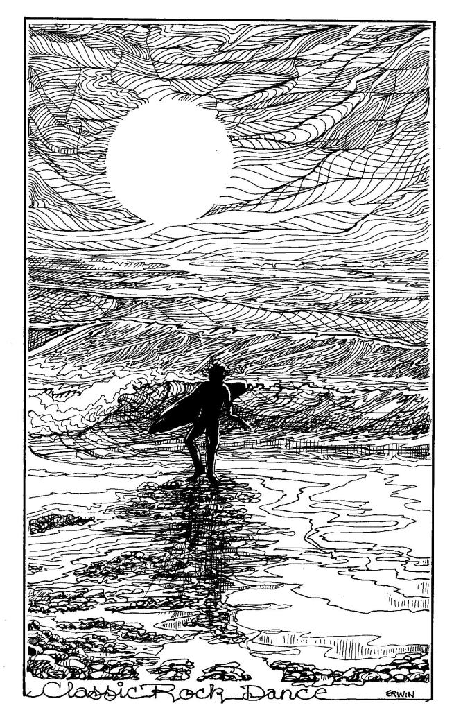
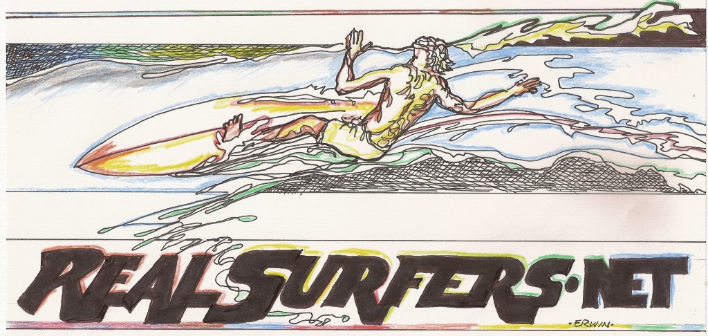
I did go on a little too much on the WSL stuff. I intended to just post some of my new illustrations.

OKAY, that:

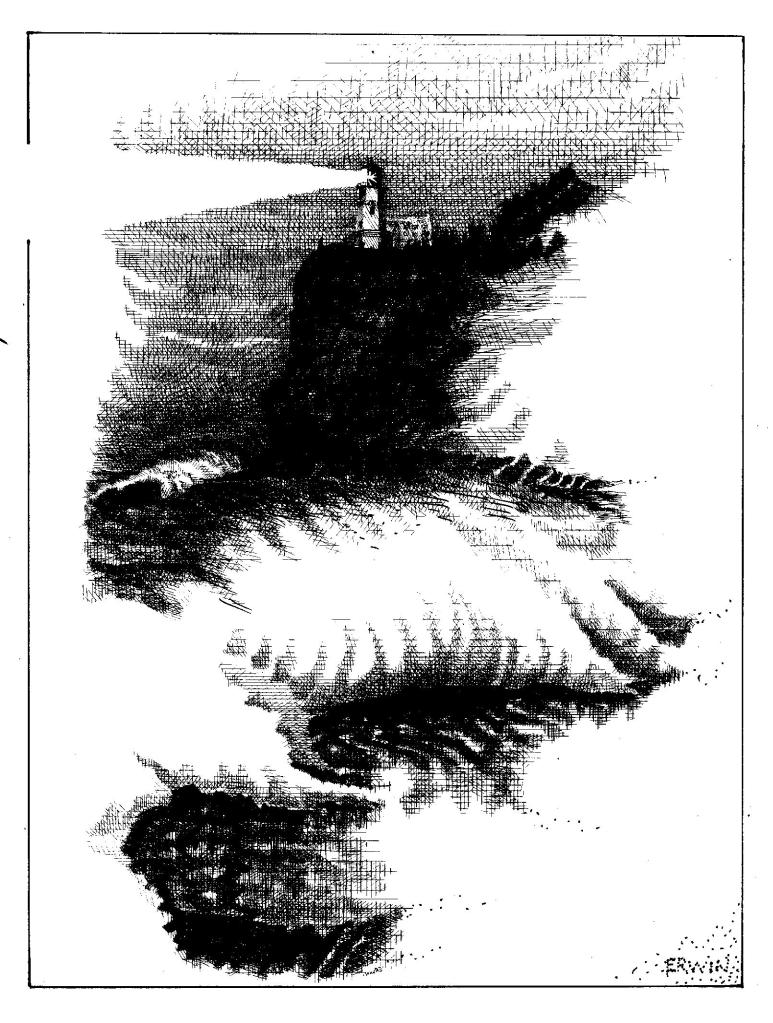
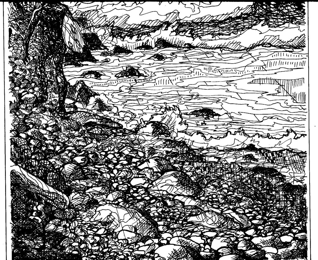
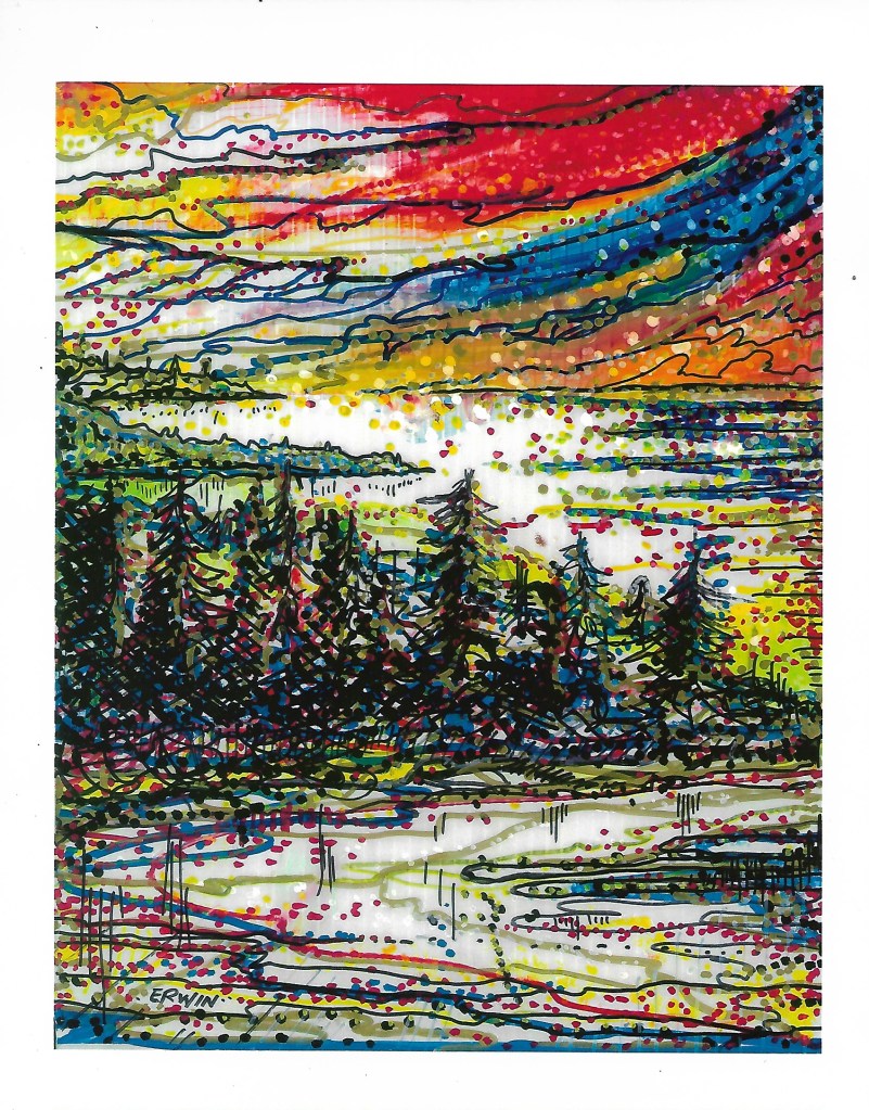
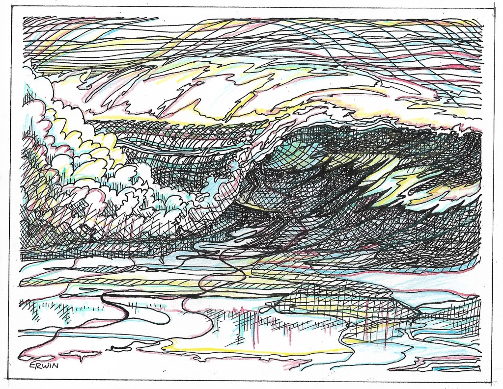
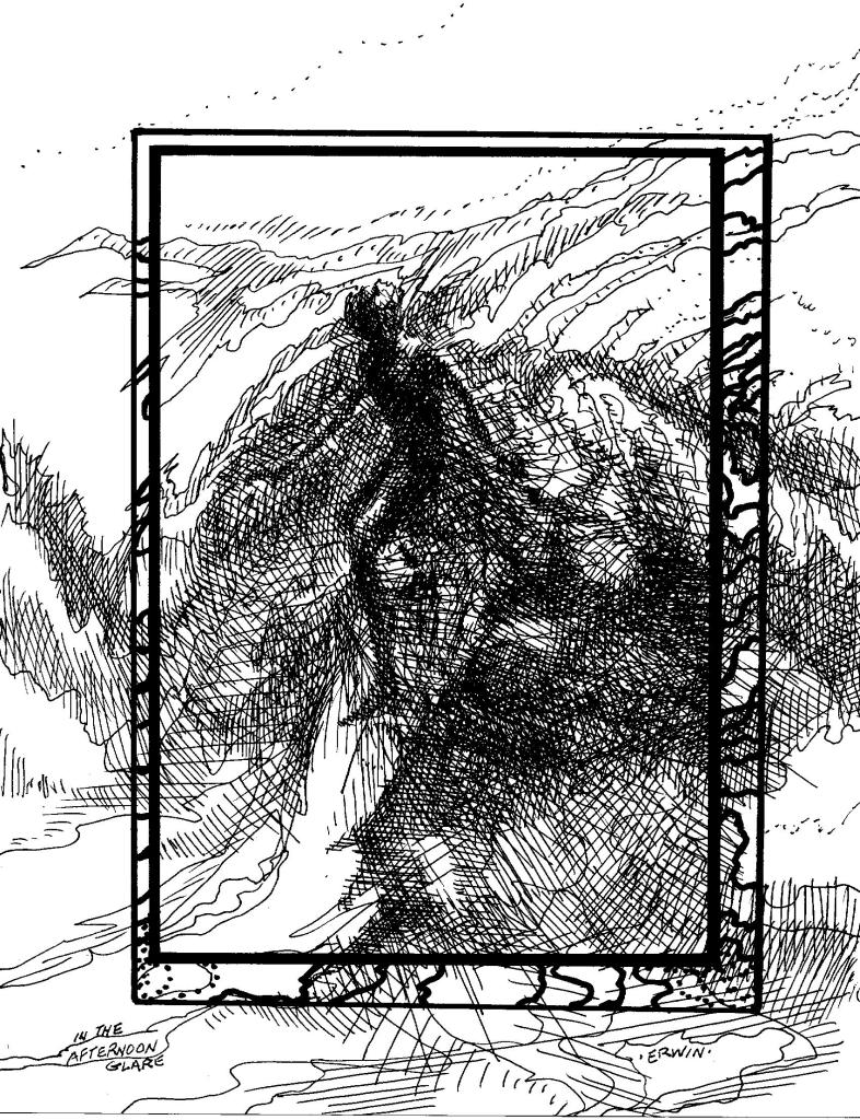
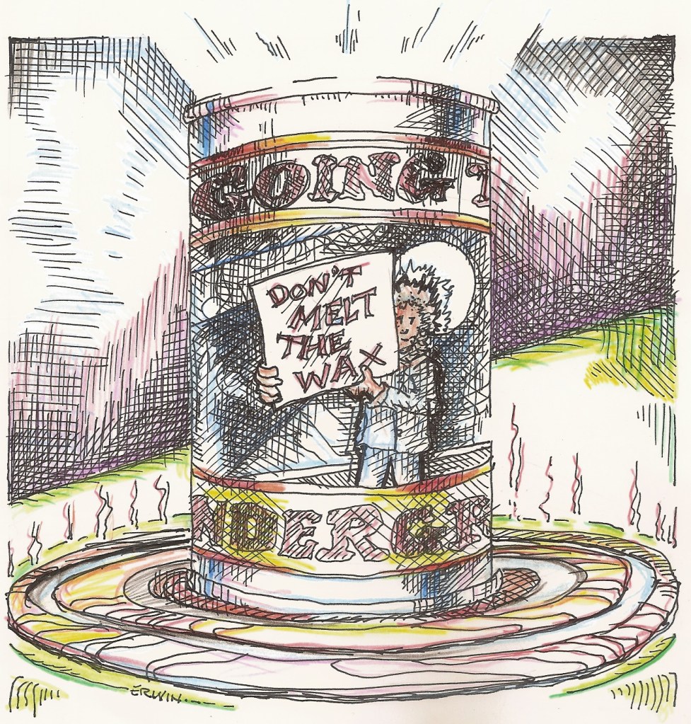
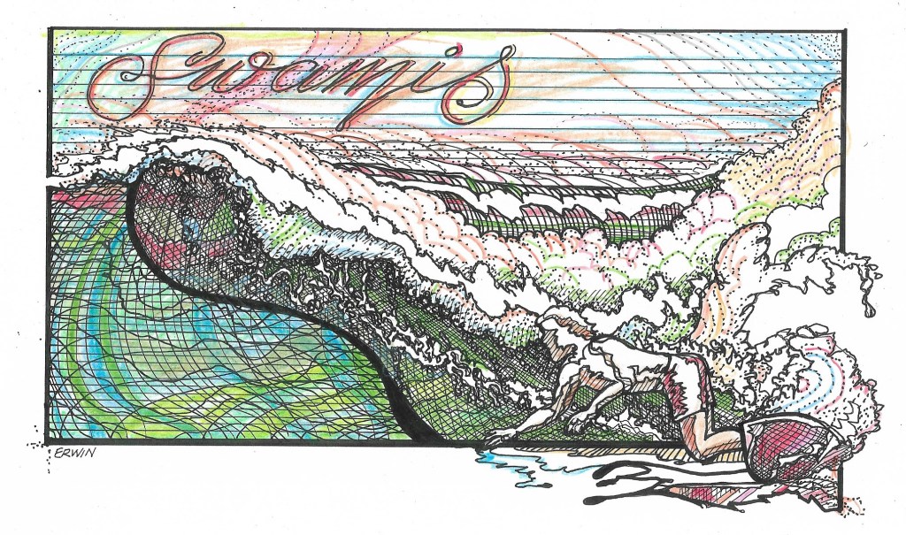
JUST A BIT of explanation- The top part of this image is all I felt I could save from a larger drawing. The lower part was intended to be a WOLF. Maybe it’s the ears, but even I think BEAR. Oh, and maybe it’s the computer, but the colors seem to have come out way better than usual. WOLF/BEAR.

NOW, what I overwrote about the WSL:

It has become quite popular to criticize the shit out of the WORLD SURF LEAGUE, so… why shouldn’t I?

OKAY, I will.

Though I do appreciate that I can watch surf contests from all over the world on my big screen TV, and after I repeat an assertion I frequently make to doubters and haters that the difference in the wave riding skills of top-level competitive surfers and even above average non-competitors is proportionately greater than the difference between your local rippers and those who can objectively be labeled as kooks. HAVING SAID THAT, I leave a lot of room for those free surfers who are as good, and often better, as the men and women who seek fame, fortune, whatever, by subjecting themselves to the boredom and tension and the whims of judges.

OH, yeah, judging is SUBJECTIVE, subject to some person’s opinion on whether this air is more difficult than that carve, whether a floater is more functional than a kick-stall, whether making fifteen jitterbug moves is cooler than just being in the optimum position. People, even judges and even commentators and company executives could, maybe, even possibly, evenly reasonably influenced by companies that sponsor surfers as well as surf contests.

NOT THAT this happens, or that the WSL would bend a bit to keep or to even get popular surfers on the tour, or… or, or…

BUT a little behind the scenes stuff from the two seasons of that series about, you know, winning and whining and (I couldn’t remember the title and didn’t want to take the time to search further- but I did watch every episode), showed that in judging, there is a head judge who makes sure the other judges are on the same page. SO, yeah, totally subjective, semi regulated and controlled.

MAYBE.

SHIT! I didn’t want to get this involved. THE MID-SEASON CUT was completed. Twenty-two men, ten women. Elation and tears. I stayed up a little later than I would have to watch some critical rounds of the WSL contest at MARGARET RIVER, WESTERN AUSTRALIA.

YES, it was the last heat of the day, but as soon as it became apparent that SALLY FITZGIBBONS was going to lose, I turned it all off.

NOW, I do find it easier to follow women’s surfing. Not all of my surfing friends even give a shit about contests. Some do. Some have favorites. My daughter, DRU, thinks Tyler is a bad ass. She is. TRISH, based on watching, kind of over my shoulder, a contest from Huntington Beach a few years ago, became a COURTNEY CONLOGUE fan. I wasn’t, so much, but Trish keeps asking me, “How’d my girl do?”

Oh, she was underscored, just as she was in the BELL’S BEACH contest. A fierce competitor, Courtney didn’t make the cut. Sorry.

AND NOW, Sally Fitz, Sal, she’s out. Didn’t make the cut. Because Sally lost in the quarterfinals to Caroline Marks, this other woman, who, I believe, Sally defeated earlier, is in the top ten, and is still on the tour, and Sally… well, I don’t know. I turned the TV off and went to bed.

HERE is how to defeat a contestant as experienced, as capable, as skilled in SURFING TO THE CRITERIA as anyone- Sally: Give her a 3-plus on a well-surfed wave. Give Caroline a 7-plus for a similarly surfed wave (but backside). This difference in scoring puts Sally at a disadvantage. SURFING well is all about confidence. Surfing scared or angry or tentatively is not a losing strategy. Sally fell or took off on the wrong wave. Caroline got a well-deserved score. She won the heat. And she would have without any scoring help. Sally didn’t get a last second gift/miracle buzzer beater wave like CARISSA MOORE did in the heat before hers.

Sally’s out. She had a long career. She’s popular. She may or may not go on to the CHALLENGER SERIES.

I DON’T KNOW.

There is a WINNING FORMULA. With so much study done on how to win a heat (priority and time management, having that Kelly Slater turn on lock, knowing which claim to throw when), watching eight heats in a row has become… kind of… less thrilling. IF A SURFER can’t figure it out, hire a coach, do the work (always gets me, surfing as work), perfect that tail slide and that fin drift, remember to cut your competitor off from a last wave even if he or she can’t possibly get enough points to beat you (these are not your friends in the water), be ruthless… and always appear humble in the post-heat interview, always wear the hat and the sunglasses.

I watched a child/teen contest recently, from Trestles. The formula worked. Turn, turn, off the top, fin slide. If the kids didn’t have the moves down, they will. Coaches, sponsors, judges. 

ALL THIS SAID, I don’t exactly know how the WSL could do a better job. AND I do enjoy the big screen coverage. WAIT, how’s about they mix up the time-filler ad between heats? How about… I’m thinking. If I can’t sit through a bunch of heats next time, maybe I’ll just watch the shorter versions on YouTube.

Original Erwin, Surf, Swamis, Squalls, Fantasy Surf Spot Illustrations, slightly off kilter (scanner, not the artist)

We have to, occasionally, scroll. My fault. I haven’t figured out how to tighten the borders on Drucilla’s Mac.

BY WAY OF EXPLANATION:

The ORIGINAL ERWIN LOGO thing came from trying to simplify my drawing style, such as, I’m often afraid, it is. Yes, I am planning on doing some more t-shirts as soon as I pay my taxes. I tried to make both sides of the wave match, then went to THE PRINTERY in Port Townsend, had Steven do the reversal/blue thing. I was so excited that I didn’t really perfectly align the reflection part. Close.

BECAUSE the SAILBOAT RACING THE SQUALL drawing was already being copied, a version came out blue (and reversed).

THE SALISH C tugboat illustration is the subtle color version, the colors all the more subtle(ized) by the vagaries of multiple copiers and printers and computer screens. Subtle and Simple are so fucking hard (I can say fucking because, so far, no one has told me not to. Still, I’m fucking cutting back… damn it).

THE YOUNG WOMAN illustration is another attempt to draw women without overdrawing. It is another possible cover or title page for “SWAMIS.” I have Dru working on adding some perfect non-hand-drawn lettering. She has, but, because I don’t know how to sign in to her acrobat account, it is unopen-able on her computer. It would be able to be opened on the laptop Trish is hanging on to, but then I would probably have to fucking (sorry) find it. AND YES, I’m so so close to finishing the final go through on the manuscript, trying so hard to keep it around 95,000 words.

FANTASY POINT. Here’s the point: Two local artists, JESSE JOSHUA WATSON (I insist on calling him Jesse Merle Watson- easier for me to remember) and STEPHEN R. DAVIS have done paintings of fantasy point breaks. I’m competitive.

I would put Jesse’s version up, but I would have to contact him and… and, anyway, no one wants anyone to believe any rendering or abstraction of lineups that don’t actually exist (yeah, maybe Indonesia or Surfer’s Journal) might be real. BUT, both Stephen and Jesse surf, so we do share similar inspirations. Maybe… okay, I’ll call someone who might have Jesse’s number. Meanwhile, google him. I DIDN”T SAY my interpretation is better. To quote another surfer/writer: “I wouldn’t say ‘better,’ I would say ‘different.’ ” I will gladly accept DIFFERENT.

PLEASE REMEMBER, all the rights to all original works on realsurfers.net are owned by someone.

Sometimes Stuff Works, And Sometimes…

… less so.

This is my first time attempting to use my (suspect, quality wise) printer/scanner with my borrowed (thanks, Dru) Mac computer. I managed to get these without calling my daughter, but with some YouTube help. Please excuse the sometimes unfortunately placed bits of crap from, I don’t know, somewhere, and the wasted white space because I haven’t mastered the sizing part of all this. I could comment, at length, on each of my latest attempts at… whatever it was I am trying for. I will try not to.

Top to bottom:

“Racing the squall line.” Because I am involved, trying to assist Port Townsend librarian and fully-frothed surfer Keith Darrock in putting together an event, tentatively titled “Inspired by the Salish Sea,” I used the view from Port Townsend. I am inspired to do at least one more with the view surfers on the always languid Strait of Juan de Fuca, desperately looking to the west for any sign of an approaching swell more frequently get, an incoming squall. Worse, another shit weather front.

“The Salish Sea.” Possible title with info for the event or events on the rest of the page.

“Quilcene.” The Quilcene Village Store, quite the hip place nowadays, has several of my drawings in the sort of sitting/coffee area. They have been having a sort of contest to come up with postcards representing the area along Surf Route 101. This is my entry. When I showed it to Trish, she said, “Uh huh… it’s… okay.” This is after she poo-pooed the earlier version with a similar background (Mount Walker), but with a person in the foreground to add more, you know, like, interest. “Creepy,” she said. “Looks like a killer.” Okay, I rubbed him out. Metaphorically.

“Untitled Woman’s Face.” Trish told me I should draw some of the characters for my still-almost-finished novel, “Swamis.” I said, something she already knows, that I have trouble drawing women’s faces. I actually kind of cheated on this one. Googled “How to draw women’s faces.”Some… tracing was involved, just for stuff like, getting the eyes kind of lined up. Guaranteed, the drawing looks very little like the one I tried to copy.

“Inspired by the Salish Sea.” Definitely redrawing this one. The blank space is to allow room for the dates and times and the various speakers. “What I was going for,” every artist or writer (or surfer who just blew ten attempts at a floater) says, was a sort of Victorian, possibly Art Nouveau look. No where close. But… next time…

“Real surfers froth.” Yeah, it’s kind of like post-psychedelic graffiti, totally unreadable. A series of mistakes began when I didn’t allow enough room for the T in FROTH. I thought I kind of fixed that with the overlap. No. Then, when I took the original to the Printery to get reduced, part of the F and part of the H were cut out. Okay. So, maybe some color would help with that. Not really. Still, someday, this will be on some highest bidder’s wall, and when visitors ask about it, he or she will say, “I believe what Original Erwin was going for here was…”

Better. Always.

SWAMIS Note. Adam Wipeout and his family are down there. It is close to Legoland. I got a nice image the other day. Almost no one out, perfect conditions, and… yeah, I’m fine with it. Totally one hundred percent… fine.

Pulling on the Art World Door

This is one of the paintings realsurfer and real artist Stephen R. Davis has been producing during, and particularly since his epic battle with Lymphoma. Not that it’s over. Steve is offering limited edition prints and posters and cards of this and other paintings. I asked him to send me the image and the contact info so others can get in on purchasing some of his work. I don’t really communicate with him on ‘social,’ BUT I will get the connections sorted out.

MEANWHILE, I am perilously, dangerously close to finishing the manuscript for “SWAMIS.” I mean, like, today if I don’t get distracted by rumors of waves. THE ISSUE is, how to sell these things, also including ORIGINAL ERWIN t shirts and, yeah, I have some art works of my own (less so with my dark-of-winter obsession with finishing the novel.

BUT, and this is related, my daughter, Drucilla, also engaged in her own battle with cancer (Fuck Cancer), is getting back into the work mode, AND she has skills in setting up some platform on which Steve (and our mutual artist friend, Reggie) can market our work.

AS FAR AS the selling “SWAMIS,” I have some ideas. First among them, as I try to find an agent, is offering a limited edition version, printed on regular paper, and contained in a Pee-Chee folder, a critical item in a 1960s students’ life, and something that is a part of the “Swamis” narrative. With pockets on both sides of the folder, a reader could easily slide pages read from one to the other. AND I would include artwork I have done in connection with the manuscript. ALL NUMBERED AND SIGNED, of course.

AS WITH Stephen’s contact info: I will have to get back to you on that.

AS FAR AS rumors of waves; probably just rumors.

“Swamis” Parking Lot Outtakes

I posted this late at night, and woke up knowing I had to make it clear that these are sections cut out of the manuscript. This material does go along with the storyline, and is, itself, edited. I can’t seem to stop myself.

I say “these” because I also did some moving of paragraphs. Joey in the parking lot:

Chulo knew the truth.

The truth is Chulo jerked the wheel and moved over far enough that the Jesus Saves bus went into the ditch. I stopped. I backed up, ready to go around the bus and see what happened with my father. Chulo had a better view. He motioned me on. I knew it was fucked up, that I was in more trouble. I knew my mother was ahead of me and had seen her husband pass her. I knew my father would be fine. Angry, but fine. He was always fine.

I am not offering excuses. My father hated excuses. “There is no such thing as a good excuse.” Second part. “Even the best excuse is a bad reason.”

Nine-twenty-seven. Time in the sun had not cleared the water from my watch. It had converted it into fog on the inside of the glass. I was dressed for work; chinos, a light blue shirt with a collar, short-sleeve, not yet tucked-in, off-white Levis cords, slightly bent-over-at-the-heel leather shoes. My surfboard was inside the Falcon at an angle, the nose against the back of the passenger side of the front seat. I moved the notebooks from the towel but left them on the hood. I draped the towel over the board. My trunks were half-hung on the fin of my board. I pulled up the tailgate, rolled up the back window, and locked the back door.

The red notebook, with two pages for February 27, 1969, on the hood, was still open, but face down. I stuck my hand under one side and flipped it closed.

I looked around to see which car full of tourists or families who sometimes went to the beach, or which surfers, looking for a first or second session, might want my spot. Surfers, three, in the car, four boards on the rack, stickers on the window from Chuck Dent and Harbour. L.A. surfboards. No, not them. I pulled a green apron from the back of the front seat, passenger side. A circular logo with “San Elijo Grocery” and “Cardiff by the Sea” and “Since 1956” was silkscreened in white. “Jody” was stitched on the front, pocket high on the left chest side, in yellow. I put the apron on, let it hang, and walked to the edge of the bluff.

Choppy. Crowded. I looked down at the stairs. Julia Cole and Duncan Burgess were two stairs above the landing, their boards leaning against the fencing at the ninety-degree corner. Julia had her omnipresent gray bag on the deck and her camera resting on the railing. She was aiming a telephoto lens toward the surf break.

Duncan, not too involved in the camera work or what was happening in the water, looked up and at me. I didn’t step back. Duncan tapped Julia Cole. She shook him off, he tapped her again, she looked around and up. I stepped back from the bluff.

I looked up, toward but not into the sun. Just for a second. Just long enough that I saw a few blinks of red. I took another step back, blinked. Okay.

            There was the truth of what happened on the road just east of the Bonsall Bridge. There was what I saw in flashbacks: The low sun in my eyes, the red, spinning light and the car coming straight at me. My mind, I theorized, might put events that passed by so quickly into slow motion, into crystal focus.

            It didn’t. Rather, it hadn’t.

I flipped the red notebook open, looked at what I had written. I closed the red notebook. It didn’t matter. Everything else I wrote in there for February 27 was a lie. For the next four days I wrote nothing. Mourning. Excusable. 

I thumbed through the pages for the days before February 27. Notes and little sketches of cartoon teachers and classmates, cartoon waves, psychedelic lettering for various surf spots. “Grandview.”

That was enough. I visualized. I would be happy enough to admit I was merely remembering if it wasn’t that, eyes open or closed, I could see what I had seen. If it wasn’t reliving the moments, it was more than just remembering.

Nine-thirty-nine. I set the red notebook down on the towel and turned back toward the water. I looked at my watch, walked over to the bluff. A set of waves, four, ruffled the horizon. The waves moved toward the point, each one growing in the rough water beyond the fields of kelp. The first wave cleaned up, picked up sparkles along the top edge and a sky-reflecting line two-thirds of the way down the face. A darker horizontal line, the wave’s true color, widened, lengthened, moved up, became a shadow version of the true color, as the wave steepened, and a definite peak formed. Another bright line, reflecting the flat, clean water inshore, appeared, three-fourth of the way up the wave. The lines became other shapes, irregular, but balanced and moving. The dark line became almost black, the topmost line almost white. Energy against gravity, tripped by underwater fingers of ancient rock. Explosion. Shades of green and blue on crazed white, the true wave color moving down the line, the explosion following it. 

One of four surfers in the water paddled for the second wave, pulling with two even strokes, pushing off and up as she and the board dropped down. She. It had to be Julia Cole; smooth, graceful, goofy-foot. At the bottom of the wave, her legs compressed, her upper body straight, she raised her right arm and leaned back. Her left arm low, her right hand and arm were tracing the shape of the wave as she moved up into a position high on the wall. She shifted to more of a parallel stance and crouched. The wave, at the highest point, just below the lip, was almost transparent. Julia Cole was flying.

Julia Cole.

There are an infinite number of ways to tell any story. So many choices. This is undoubtedly my biggest problem in completing “Swamis.” Somewhere between a sketch and a rendering is a novel.

I’m getting there.

“Swamis.” copyright 2020. Erwin A. Dcnce, Jr. All rights for original work in realsurfers.net are held by the author/artist.

New Original Erwin’s Originals*

Perhaps I should explain the process. I draw something (the actual original*) and then I dick with it. Perhaps I should explain dicking with it: Get a copy, possibly a reversal (black to white, white to black), then I do some coloring.

In the case of the Orca, and I have drawn Orcas before. Okay, once. So, Stephen Davis’s girlfriend (bethrothed [sp], couldn’t spell fiance’ [sp] correctly either), Sierra, evidently, wanted a birthday card featuring the beloved and feared local on the Strait of Juan de Fuca and the Salish Sea, and, more local for me, occasionally patrolling the Hood Canal. “So, hey, Steve; why don’t you just draw her one?” “Maybe I will.” “Maybe I will.” “Okay.” So, I drew this one:

Yes, it is in color. I didn’t scan the black and white version

Okay, so, as usual, I show the drawing to Trish. “Orcas are, you know, black?” “Isn’t it?” “No.” Okay, so, with the illustration on my clear plastic drawing board, I trace the outline and do a drawing where the black will become white (printery- my scanner sucks). Then, hanging out at THE PRINTERY in Port Townsend while STEVEN does some machine/computer interface magic, and a constant stream of customers cruise through the doors, I color in the reversed image. Still, I was a bit hurried. The result is this:

The white and black version looked way too flat… flatish

Yeah, well; I felt compelled to put in something, partially based on Stephen Davis’s recent run-in with supposed locals, about how there are true locals. Despite getting good reviews from any of the PRINTERY customers who happened to check out my stuff (one guy commented on my use of crayons. “Um, uh, no; colored pencils.” “Still…”) I am not totally happy with the coloring job (kind of lose the orca outline), but then, I’m never truly done with any drawing.

I have the originals. I can go back. Some time. Later.

Meanwhile, here’s one my scanner wouldn’t let me scan last time I tried.

Not sure what to do with this one. Tried it as a Holiday card. Maybe I’ll try again.

I did post this card before, as in before I added the new stuff.

Plain and…
…fancy.

Because of the seasonal (paying) work slowdown, and while it’s cold and rainy or colder and sleeting, even colder and clear, I continue to work on the third full rewrite of “Swamis.” I know the story; I know each of the characters so very well; I’ve endeavored to edit and cut and chop. Stephen Davis, when I showed him the illustration immediately above, said, “Maybe your writing is kind of like… this.” “Yeah. It is.” My philosophy on the ‘psychedelic’ drawings is that ‘it isn’t done until it’s overdone.’

I love simple, but simple is really… difficult. I’ll keep trying, but I am stubborn enough to not give up on the purposefully kinetic and the clinically insanely overdrawn.

I do have something ready; an outline that was an attempt to simplify the trilogy I tried to cram into one book; an outline that became something, mostly because I just fucking love the dialogue, more a script than a treatment. More on that forthcoming. If you can help me sell it, let me know.

Merry, Happy, Peaceful, and; I just couldn’t keep it simple, a few lined-up waves to lean into.

More Tomorrow

The easiest way to show one of my clients some of my artwork is to have her check out my website. Because it is really just one page and really disorganized, it makes sense to, occasionally, pull some already-scanned drawings out of my media file and display them here. SO, HERE:

Boatyard Mike Surf Vessels

There’s nothing in this post about voting out our esteemed president. Some hope, yeah; but nothing negative about the… dude.

EDIT- I woke up realizing I couldn’t let that go. I have been wondering about who, with so much truth available on what an immoral sack of deceit and seemingly bottomless self-centered meanness our power craving fuckwad of a president is, could continue to salivate each time he slurs out some new slurry of lies and just plain shit.

Make no mistake, like the people he has scammed in the past, you, if you are not someone filling your pockets in this new age cleptocracy, you are someone your leader, no doubt, considers a sucker and a loser. How much you have to lose is easily accessible. Oh, you might have to look somewhere other than Fux News.

Vote!

Vote!

My first SUP was, I thought, twelve feet long. As I have with every board I’ve ridden more than a few times, I thrashed the shit out of it; rode it over a few too many rocks, rode it onto a few rocky beaches. Surfing; that’s what boards are for.

By the time I got a newer board, that one was sooo heavy, soooo dinged up. I stuck up against a tree, hoping it would get lighter. Didn’t really work. Since I didn’t think I’d ever ride the thing again, I decided to strip it down and make a shorter, more responsive, lighter one.

My current board, a Hobie, is ten foot, six inches long, has carried me through thousands of waves, over many rocks, and is appropriately thrashed, poorly patched (drips, not sanded out), and, since I seem to be knee-boarding more and standing less, it seems proper that I go for a smaller board.

Yeah, but I still want it floaty enough to use a paddle. This is where the twelve foot comes in. After looking at the dead SUP and imagining how I’d cut some off the front, some off the tail, do a minimum of trimming, and, yeah…

No. The board was eleven feet, and, with a little cut off the front and back, with a skil saw, I suddenly had a really rough seven foot six blank. OOPS. I did, after stripping off the glass, throw it in the water to see if it would float me. Maybe, hopefully, not really sure. I’m also not really sure if, even if the blank did, if it as a further shaped and properly glassed board would.

So, after purchasing a couple of tools, including a plane for the stringer, and spending way too much time trying to get, like, one rail that matched the other side, I had roughly shaped a fat, downrail, pocket-rocking, fish-tailed, wailing vessel.

Yeah, well, that’s when I got ahold of Mike Norman, formerly nicknamed Mike-eee, not because there’s an E in Norman or anything, but to differentiate him from Mike Squintz. Well, Squintz has gone back to Florida, and, anyway, most surfers in the area called him Smoker Mike. Well, when he actually gives up smoking… Mike does work at the Port Townsend boatyard; not sure where, specifically, and he has been building a few surfboards lately, and, anyway…

Anyway, even though I heard Mike would have been farther ahead if I hadn’t tried to be all Skip Frye/Mike Hynson on the blank, I have made a deal with Mike; he finishes the shaping, figures out the fin setup, does the glassing. I might sneak in and do some graphics; oh, and some money will change hands, AND I will give Mike the 5’9″ Bic fish I got cheap and used from Al Perlee down at the Surf Shop in Westport, tried to ride. Once. Mike has kids who can use it. Even though I rode six foot boards for years (years ago now) a 5’9″ looks like a toy to me now.

Oh, yeah; and I was a bit lighter, also. Oh, yeah; and I said I would do a logo for Mike’s boards. Here it is:

I do need to make it a bit, um, simpler. Yeah, working on it.

Now, if it comes down to a few pounds that makes the difference between a paddle and no paddle… again, we’ll see.

Cleaning up Swamies… oops

All right, here’s the illustration, so far:

And here’s what went wrong. I was working on the lettering, and had it pretty much done while sort of watching another British murder series on Netflix. Just as they revealed who really done it, and just as I was about to show Trish, I realized I had spelled Swamis incorrectly. Swamies.

Great. So, white out. I’ve taken to using the tape; sort of wroks (I mean works). SO, then I make a copy with my prin ter (also sort of works- images come out a bit crooked), and go back in and fix it. WELL, not yet; I’m thinking of getting a negative image, adding a bit more white.

If the image looks familiar, it’s from a Ron Stoner photo of Billy Hamilton, 1966. Mr. Hamilton is actually in my novel, “Swamis,” and probably from the same era. After one of my most memorable Swamis sessions to that point, from the ‘old men stop here’ platform on the stairs that were there at that time, I saw him cranking the most beautiful and flowing roundhouse to off the foam to in the pocket move (move as in it was seamless) I have still ever witnessed.

OKAY, so I took out a couple of other surfers who were in the Stoner photo, didn’t do justice to Mr. Hamilton. He’s stockier in my illustration, wrong here, not leaning into the turn as much as in the original… yeah, yeah… Hey, I am giving credit to Ron Stoner. His photos were, after John Severson’s in the first issues, the very heart of “Surfer” magazine; they captured the magic and mystery of the era.

I DID do a bit of a search for the photo, not wanting to risk scanning the photo ripped from an issue of “Surfer’s Journal”; ripped out only because there was some sort of misprint ting in that issue that ended up with most of the middle of the magazine duplicated. I didn’t find the actual photo, but I did find another Stoner photo.

When I was a sophomore at Fallbrook High School, 1966/67, Donn Fransich (sp?) brought in some “Surfer” magazines for show and tell in, I think, History class. He would stick them on the tray of one of those heavy, clunky overhead projectors. The photo on the right is one that I remembered from that his presentation. Not perfect, but perfect.

I’ve always remembered the photo, always wanted to see that vantage point in person. Coming back on the bus after a wrestling match with San Dieguito High School in which I actually didn’t lose, I still swear I saw surfers above and beyond the Self Realization Fellowship compound. When I lived in Encinitas in the seventies, I would often drive down the hill; again, looking for that magical image.

That Ron Stoner disappeared mysteriously; no, that doesn’t diminish the magic, not a bit. It’s there, the magic we chase; moments and images. I have caught some moments, surfing, that I will not forget; I am still trying to scratch and erase and capture, to flow into a perfect image. Not there; might never get there.

A New One for “Swamis”

I should, first of all, apologize for the coloring of the new drawings. A little too much for the one, maybe not enough for the illustration of Ginny Cole, some lettering added.

So, that’s about it. Stay safe, surf when you can. I do. Can’t say much more.

I am working on the manuscript; and, as objectively as I can be, I do believe the advice I’ve received is helping to make it better. If I can compare it to house painting, we get it all painted, then do the “Tighten up,” going back over all the surfaces, making sure it’s tight.

Not there yet, but working on it.