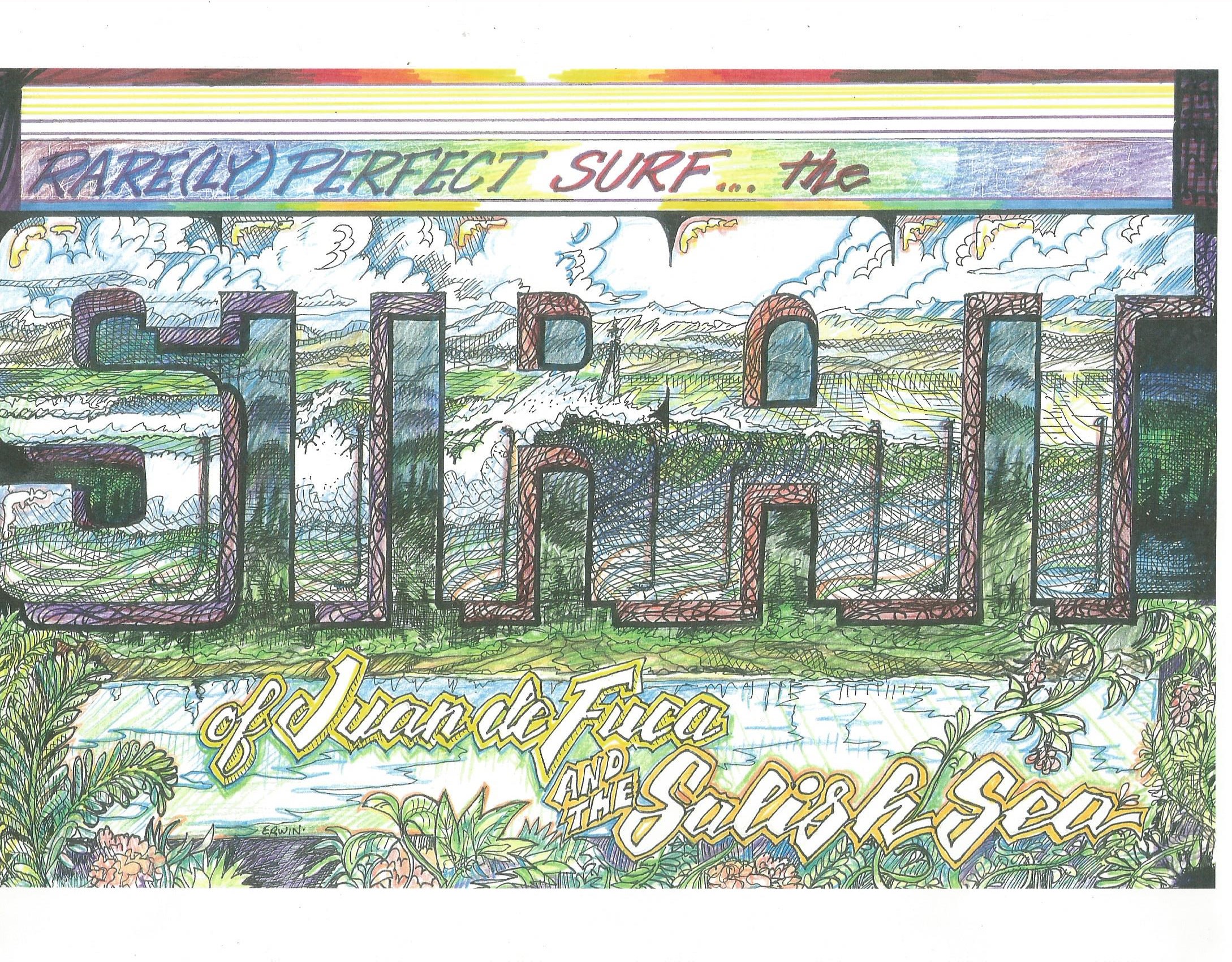
What I was going for, of course, was that look of classic produce labels. What I have to offer, perhaps, that other artists pursuing surf-related images, is a background as a sign painter. If I’d made the lettering fatter, I might not have gotten too busy with the other images. As soon as it was done, I knew it was overdone. Damn! I considered cutting out the main lettering, chucking everything else, going with a darker, bluer background, with horizontal stripes. This would play into the ‘strait’-ness.
Yeah, I still might do some cutting and pasting, like, with a real knife and paste. Meanwhile…

Erwin, may I suggest a nice yellow border of Scotch Broom to accent the bottom of your graphics?
Excellent work my friend but seriously consider the Scotch Broom.