On Wildcard Sunday…

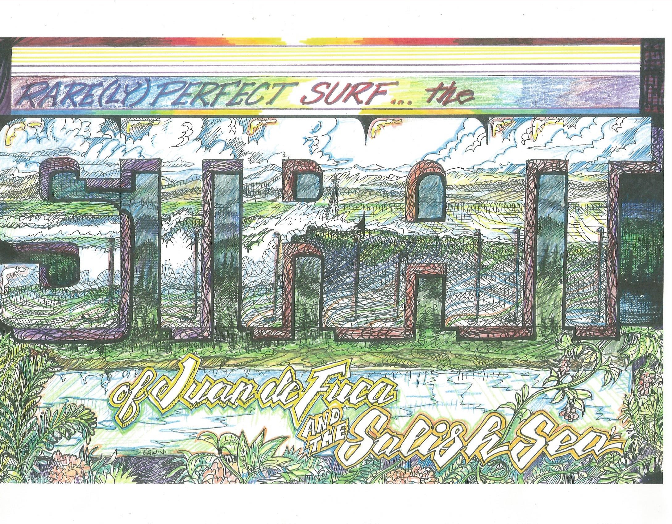
The actual drawing is a bit too big for my scanner. This is, however, most of it. Thinking posterization, I started the drawing on Saturday, worked on it off and on, then, up early on Sunday to maximize the pre-game preparation, I added more up to and during the Seahawks/Vikings game.

Image (27)

When I decided, sometime after my wife, Trish, decided she couldn’t watch any longer, probably about the end of the third quarter, with the Seahawks behind 9-0, that I should pay more attention, give a more focused fan, um, whatever it is fans, and, in particular, fans watching on TV, might be able to contribute to a team effort, I set the drawing aside.  I went back to it before and after dinner, put my name on it some time during our delayed viewing of “Downton Abbey.” Look for a color version some time before the Seahawks take on Carolina next Sunday. I’ll be listening to most of it on the radio, cosmically cheering, as Trish and I have decided we can’t really watch close games together.   GO HAWKS!

Meanwhile, I’ve been trying to will some favorable buoy readings. Okay, I’ll focus a little more; see how that works.

It always works.

Eventually.

Just Chchch-Changing a Few Things

Back at Palomar Community College, taking all the art classes I could get into, I never quite fit into the scene. This was 1969-71, and it seemed more important to look like an artist than to actually turn out something original or real. Things haven’t changed that much. I really started this paragraph to say that I also took creative writing; also didn’t seem to fit in. Thing is, the artists seemed to think I was really better suited as a writer, the writers (not that I asked them, it was painful enough to act like I didn’t hate their stuff) seemed to think I was more an artsy guy.

The problem persists. It should be noted that my drawing is more influenced by Rick Griffin’s work in “Surfer” than anything I learned in class; my writing… well, nowadays I just write the way I want to write. But let me add, I so appreciate any image, verbal or visual (include music and song and, sometimes, smell) that causes me to stop for a second, or longer, just to enjoy; temporarily overwhelmed.

Image (15)Image (16)insidebreakSlider

I plan on adding some color to the ones that are still black and white. And I have more to work on, while, meanwhile, I’m working on a drawing that might be my Christmas (or fill in your choice of solstice celebrations) card. I’m imagining a view from the back of a wave, with the Olympics in the background. I’m having some trouble finding reference material for something from that vantage point. But, I’ll pay more attention next time I go surfing.

Image (18)

“Damn Strait” and “Energy Between the Lines”

I’ve been trying to come up with a line that conveys the message that there are never any decent waves on the Strait of Juan de Fuca; or if there are, they’re rare fickle and probably not worth the effort of looking for them. Everyone who has tried a few times has been skunked on a percentage of these trips. The drawing is utter fantasy. Sometimes the waves are, too.

Image (12)

I’m also always trying to come up with a slogan for realsurfers.net other than “shoulder hoppers and name droppers.”

Image (13)

As with everything, working on it. Since I fired up the printer/scanner, I figure I should add at least one more so I can do a medium size; something one can look at without moving the image up and down. The waves may be going off right this minute. Somewhere, they no doubt are.

Image (14)Image (12)Image (13)

Not that it’s all that relevant, but, after getting the drawings reduced and a couple of copies at the Fed-Ex/Kinko (unless they’ve dropped the Kinko altogether) yesterday, I made some inquiries as to what it would cost to put together a little book of illustrations. I discovered that… well, my second or third question was, “Then how does anyone make any money with books?” “Um, maybe a… printshop? Volume? Um; hey, we don’t know. That’ll be $3.66 for the copies. Oh, and you have some pens?” This morning I discovered the pens that make that in-between line I really need, the two-pack… blue. Not black. Blue. Blue like one gets from a trip to the Strait. Maybe the good kind of blue. Damn, I could have been there by now.

Sorry, I was just interrupted by Adam Wipeout. “I think it’s firing.” Bluer.

Two New Surf Illustrations

I ran into Andrew, another house painter, up in Port Townsend yesterday. Checking out a historic building in the Uptown area, stepping back into the street, I practically ran into him as he got out of his car. We had passed each other at the paint store, but this time he was out of costume and carrying a small painting on canvas. It was a scene of this very street, almost black and white. Because I have questionable social skills, I took it from him, checked it out.

Andrew is through, he says, with exterior painting for the season. “Oh. No, it’s still warm enough,” I said. No, I’m no where near through with exterior painting.  He plans on building his inventory of paintings. “You make any money on this,” I asked as he took his painting back. “Maybe in a couple of years.”

Image (4)

“Realsurfer.net” has always been a portfolio builder for me. And, with longer nights, I’ve been on a bit of a roll, lately. Trish recommended (strongly) that I not add color to the drawing above. I thought it looks ‘beatnik and 1959-ish,’ she says it’s Art Deco-ish. I probably will make a copy and color that. Oh, more than probably.

Image (3)

While the top drawing evolved from a sketch, the lower drawing came from some reference material; specifically a photo of Kahea Hart at Backdoor Pipeline by Pete Hodgson/AFrame. This time, because Trish had trouble discerning the surfer’s head from the background, she insisted I add some color. No, I didn’t make a copy first. Darn.

Potential World Local tshirt designs

I’ve always wanted to design stuff for t shirts. I’ve had a couple done (by others, I just supplied the art) for local musical events. Being basically cheap, and having some experience at silkscreening (mostly on flat paper and such, my attempts at t shirt printing did not go well), I figured one color stuff would save a few bucks. So…

It's supposed to read 'world local.' I'll probably go back and put the globe into the lettering as I did in the lower graphic. And, since I have copies, I'll, no doubt, be coloring these two.

It’s supposed to read ‘world local.’ I’ll probably go back and put the globe into the lettering as I did in the lower graphic. And, since I have copies, I’ll, no doubt, be coloring these two.

It's meant to be 'world local-er' as in, perhaps, just a bit... yeah, you get it; a homeless person who sleeps under the pier is obviously more local than you.

It’s meant to be ‘world local-er’ as in, perhaps, just a bit… yeah, you get it; a homeless person who sleeps under the pier is obviously more local than you.

Slightly Overdrawn, Overbusy “Strait” Poster

What I was going for, of course, was that look of classic produce labels. What I have to offer, perhaps, that other artists pursuing surf-related images, is a background as a sign painter. If I’d made the lettering fatter, I might not have gotten too busy with the other images. As soon as it was done, I knew it was overdone. Damn! I considered cutting out the main lettering, chucking everything else, going with a darker, bluer background, with horizontal stripes. This would play into the ‘strait’-ness.

surfcultureeventthree 001

Yeah, I still might do some cutting and pasting, like, with a real knife and paste. Meanwhile…